This Quora topic may interest you:
http://www.quora.com...killer-landing-pagesI also gave my answer there but it's kind of long and many either don't apply or no longer exist.
Also subscribe to the official Wordpress blog. They often announce new themes there like the recently popular (but I didn't like) Wu Wei -
http://en.blog.wordp...14/new-theme-wu-wei/Tumblr themes are also generally high on most people's list of great themes.
I've also recently praised Posterous' new M82 theme in Twitter but I'm not sure you're looking for a blog theme.
Some suggestions that may narrow down the choices:
--top menu driven navigation scheme (not sidebar)
Nowadays with blog services allowing for both, it's really an issue more of "does this ABSOLUTELY mean no sidebar?" or just top menu driven navigation scheme?
It just seems weird because then you mention two columns but generally two column design is sidebar plus body.
--I'm very interested in nice color schemes
Could you narrow it down to dark/white/minimal...that kind of thing? For example Wu Wei isn't viewed as having nice color schemes in the sense of colorful but it works.
Generally any set of color that mixes well with contrast checkers work.
The feel I want for the website is like when you walk into the library of someone's 100 year old, well-maintained mansion. There's a nice leather armchair, with mahogany tables around, and on the table is a book. The book is my content, the room is the aura. That's the feel I want. This doesn't mean I want a mahogany wood background. I'm just talking about the feel.
Feel is relative. (Although this may be because I know nothing of design)
The description you mentioned goes in contrast to:
--not one of those flash-heavy sites where there's a lot of animation and very creative movements, shapes, etc. A lot of musicians' websites do this.
See this site for example:
http://www.boscoffeeclub.com/I'm not sure if that's working because it's currently isn't on my part but it's a flash site that gives a feel of the type of environment you are describing to me...but it's a flash site.
The biggest issue is this:
There's a nice leather armchair, with mahogany tables around, and on the table is a book. The book is my content, the room is the aura.
This often connotates movement and in fact your eyes have to shift to get this sensation if this were a physical room.
The only static theme that I can think of is the general design for Ubuntu but many feel the design of the operating system is very "dry" and ugly with a mix of orange and brown.
You could try the
main page or the
Ubuntu Wiki look but that's not exactly a vivid image of a library.
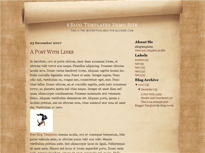
You could try searching for Parchment templates like this:
 Source: http://www.eblogtemp...t-templates/page/12/
...but they aren't exactly "out of the book" if you know what I mean.
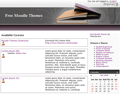
Still you could combine them with things like this:
 Source: http://www.themza.co...e-library-theme.html
But generally my guess would be that you'll end up discovering and liking a theme that doesn't match with your description (or only barely matches that) based on how you are currently describing your design.
Still... I'm no designer. I'm not really trying to criticize your original thread as much as elaborating where I think you could be much more specific.
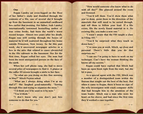
Finally going back to the book is your aura thing. You might be interested in how ubook looks in case you haven't known of the application before. You could theoretically zoom that out into a background showing a library of any kind and it would seem the book is the focus.
 Source: http://dearauthor.co...p-ereading-programs/