By the way, your grid within a grid example thing:
I think you should consider the even bigger picture. With the example you've shown, you've limited the categories to a 2x2 function...meaning there are just 2 things to mix and match. But what if there are 3 or more things? And what if each one of those things had more than 2 options (not just yes/no)? So, I would recommend that you ditch the easy visual of the 2x2 box and think bigger...perhaps in a way that might not be so easy to visualize, but is better. After all, after you go beyond 3D, things get too hard to visualize. See what I'm saying?-superboyac
I'd just like to clarify that I haven't read the book this grid is based on so I'm not sure my interpretation of the grid is correct.I think I follow you up to the 3d portion but let me see if I got you correctly: I think the flaw you see with the grid is that it fails as a "prioritizer" in that once you have too many entries it becomes no more different than 4 separate pages with lots of text on them, am I correct?
I agree with this perspective that's why I don't plan to use the grid this way. The grid is more my preference for an already prioritized list magnifier.
I'm not sure if this makes sense since for most people a prioritized list is good enough but have you ever read the philosophy of the low number to do list? (I don't know what it's actually called but the description is close to that)
The key idea with that concept was to write down only the top 3-5 entries in your to do list and keep it that way. I think this is more my preference of that philosophy. The grid over grid basis isn't so much to organize the tasks as much as it is to contextify the tasks.
Now this might fly in the face of filtering technologies that does allow an even more powerful version of this but I prefer this simplicity mostly because it's more of a visual reminder for me and I like the idea of being able to print this grid or even use an index card or post-it to create this image and just stick it anywhere outside my computer as a friendly offline reminder.
Where this basic grid idea fails for me though is in having a software version of a "plate" like a sticky note over a sticky note over a sticky note to simulate the same visuals I have of it in the real world to the digital world.
Obviously this isn't something IQ can do or is designed for so I hope this doesn't confuse the readers as to why I pointed the image out earlier. I was only recalling the turn of events that led me to trying out IQ.
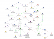
Now for more complicated organization, I use Compendium. Example:
 SQLNotes...what is it exactly?
I know this flies in the face of filtering but I find I'm much more comfortable filtering stuff presented this way. The flaw of these maps is that the foundation sets up the feel for the rest of the maps requiring another management system as a temporary information holder but once both are set up correctly, I just find it hard to go back to the more traditional line per line way of viewing things. In fact, I don't think I've ever adapted well to the old system that's why I don't have a passion for viewing help files in programs despite being comfortable reading lots and lots of webpages.
If you really want to organize your tasks with a high level of complexity and sophistication based on a "scoring" system, I suggest you look at the program myLife Organized. I've written reviews of it here:
http://aram.dcmember...re/mylife-organized/
You can tweak how "important" certain tasks are as much as you like, and it will automatically generate a list in the order of most important to least important. Forget the box thing.
I've tried MyLife Organized before but I didn't quite like the feel of it. I'm not sure if it's because when it comes to tasks I feel much more at home with the rigid structure of ThinkingRock but I'm just pointing out my current application for organizing todo tasks.
I also use Toodledo as my online alternative.
Here's one topic comparing the two programs (and yes ThinkingRock is slow because it's java but it just clicks with me so much, I use a notetaker when I want to put something in rather than having it opened all the time):
http://www.thinkingr...amp;highlight=mylifeEdit: Oh right, I just previewed the screenshot right now and I think it was the tree based hierarchy combined with it being not free that didn't do it for me back then. Please keep in mind that at the time I was looking for an outliner and was already using YeahWrite so the interface just didn't come close to my preference.
Now, you may also be able to accomplish this in IQ using calculations and formulas, and maybe even some future features that Pierre is adding. But I don't know how to do it, and it sounds hard. MLO is already there, and it's a great program, and I use it every day.
Oh, sorry for the misunderstanding. My last comment about the most used/most used column wasn't so much because I plan to use IQ as a todo manager but more as an explanation of why columns didn't gel with me.
