@mouser:The new version should incorporate my fixes for high-DPI displays which should make for nice big clear fonts on a machine where you have text size set to larger than 100%, which presumably is what you are running?
______________________________
-mouser
In response: No, that is not the case for me. I am usually using a 15" laptop display at DPI 100%.
I don't wish to appear rude, but the very fact that you asked the question like that might indicate that you don't perceive what I am on about - as though in a state of cognitive blindness - despite all my going on about visual perception and the ergonomics of the GUI.
To see things from my perspective on this issue, one probably needs to have made some effort to study and understand the theory and extensive research related to psychological visual perceptual issues and ergonomics in analogue and digital displays, but especially (in this case) regarding GUIs on computer/digital displays of different types. This would assist in the comprehension of what the perceptual and ergonomic issues probably
are.This ideally would include at least a cursory study of optics and the different effects of differing eye problems on human eyesight and perception. Until one does that, one's paradigm might well be stuck in the "Yeah, adjusting the DPI will fix it" frame of mind, because that will be one's currently preferred perception of reality for such matters (and why not?).
Of course, it's always possible that I "just don't get it" about the DPI, I suppose, but at least I have repeatedly tried to vary the DPI settings and that was shown to be pretty useless (see below).
Because I have had to study those things above, I tend to see that many of the perception and ergonomic issues relate to things including such as, for example:
- Depth of field of lenses in the eye or spectacles.
- Focal length of lenses.
- The effect of viewing natural (reflected) light versus viewing a light source, at different frequencies, on the eyes and the human nervous system.
- The effect of different types of ambient light on the perception of information on a display screen.
- Perceptual disorganisation caused by the use of certain contrasting colours in combination and at varying brightness levels, the effect of which can be amplified by optics - certain eyesight (lens) aberrations.
- The effect of the colour (temperature) of light on the human nervous system (e.g., hence the use of f.lux).
- The use of lines to emphasis boundaries between one coloured area/object and other neighboring objects (e.g., a background).
- The use of deep (non-pastel) colours to emphasise boundaries.
- The objective to enable max/optimum speed of perception and comprehension of text in the mind of the reader/viewer (for speed/efficiency).
- The deliberate use of text fonts that research has shown can enable max/optimum speed of perception and comprehension of text in the mind of the reader/viewer.
______________________
I know that you have been focused on and put a lot of work into getting your apps to respond nicely to changed DPI settings, but from my perspective, ergonomically,
changing the DPI setting is likely to be worse than useless.I don't use/change the DPI setting - it stays at 100% (which is "recommended").
One can see
why it's recommended if one
does change the DPI setting. For example, as a test, I just now changed it to 125% (125% was the
only alternative setting that the system allowed me to do). It was a constipated process. I had to do it using the
CursorRight key because dragging the slider didn't work as the setting just kept snapping back to 100%.
Having made that change and after I had logged off/on again, the visual effect of the changed DPI setting (125%) was grotesquely apparent and about as subtle and ergonomically useful as hitting the display with a brick - so one can see why it's recommended that it be left at 100%.

Furthermore,
changing the DPI
expunges all/any customised system
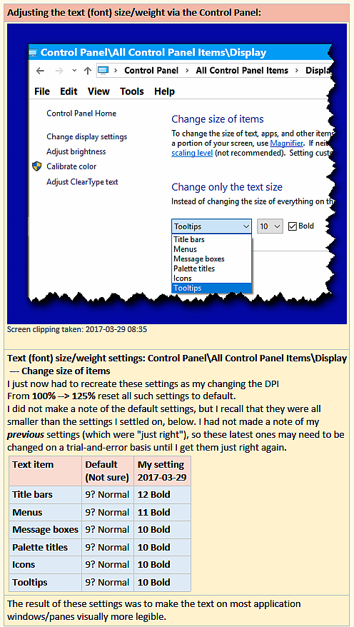
Settings for text settings (see example below), and resets them to default. So, after going back to DPI 100%, one has to tediously, manually set them to one's preferences again.
Interesting point:- Experience of experimentation with these settings leads one to the discovery that they would seem to be far more useful than one might at first have thought.
- They seem to be far superior to and more flexible and make much better (more efficient) use of the display "real estate" area than messing with the DPI, which latter should evidently be left well enough alone for laptop displays (QED) - unless one absolutely has to change them as a last resort for some reason.
For interest, here is a copy of my notes on the system settings pane that I refer to above:

It seems to me that, at the moment, the "best" solution to fix the problem of excessively miniscule fonts in these configuration panes would seem to be to change the
mode of the pane so that the user can either (say):
- (a) adjust the fonts and colours of the pane (which could do the job quite nicely, just like in the CHS GUI), or
- (b) (as a provisional workaround) zoom the pane in/out, with the zoom level being remembered for when that pane is next opened by that user.
