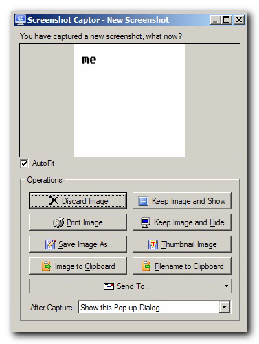
Im trying to decide which few buttons should be in the post-capture popup dialog.
Personally I don't use it, but I understand it can be especially important to new users who might be scared by the main interface.
Here's the current dialog:

What I plan to do is remove the Thumbnail button as it's not so important; and i think i'll compress the clipboard options into one button with a drop down selection; that will allow several different clipboard copy options (copy image, copy file path, copy file object) into one button.
I could leave it at that and just remove a row of buttons -- that would have the advantage of being even less intimidating.
But I could also add one or two more rows of 2 buttons each (any more than that and I think users will feel overwhelmed).
Any suggestions?
