I've wanted to post this for a long time...Whether you care or not, every day you use the computer you are probably interacting with an element of the Windows user interface called "listview". It's the interface to Windows Explorer, for one thing. It's also what drives your desktop. It's the My Computer window, it's the Control Panel, and it's part of interminable other staples of the operating system.
Microsoft made it a fancy and powerful gadget. Starting with XP, it draws a stylish semi-transparent selection rectangle when you sweep the mouse over items. It does incremental search: start typing a filename, and the selection will jump to the first matching item. It lets you edit the text of an item. It has a virtual mode that lets programmers display many thousands of items really fast. It shows icons of different sizes. When you switch from the Icons view to Details or Thumbnails in Windows Explorer, it's still the same listview control, working in one of its many display modes. The latest versions can also display headings to group items into related sections.
The Details mode is particularly handy - the one that shows information such as size and last-modified date for files, neatly arranged in columns. When you click on the column headers in the Details view, the listview sorts items; another click reverses the sort. You can drag columns to rearrange them. This is perhaps the best part of the listview - and the worst, which is what this post is about.
The listview is a standard Windows control - that means programmers have always been able to use it to build their own applications. And because it's so fancy and so powerful, they indeed have. Programmers use listview because it's readily available with its many features, while creating a like element from scratch means a months of tedious work, if not years, if you're a lone developer.
And that's the problem. The Details mode has one shortcoming: it can only accommodate a single line of text. Lines do not wrap. That becomes a problem whenever any of the columns needs to display more text than fits in the width of the window. It's a tiny step from this neat display:
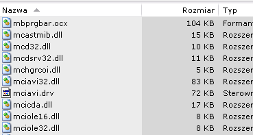
...to this, now not so useful any more:
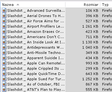
Yes, you can widen the window - but only to the size of your monitor, and besides, you don't always want a window to extend the whole width of the screen.
And yes, you can double-click the edge of a column header, and it will extend enough to accommodate the longest filename. Or you can resize columns manually. But have you tried to read a filename that spans the width of your widescreen monitor? Or read while scrolling horizontally?
I don't know about anyone else - maybe it's just me. But once I have to scroll horizontally to read something, I give up. I hate it. It's just not right. While vertical scrolling feels natural, horizontal scrolling does not; it becomes hard to track the position with my eyes and follow the line of text. Not only that, but to read the next item you first have to scroll back to the left. Let's just say when I see a horizontal scrollbar, I speak words of unkindness.
For all that, listview still wouldn't be half bad if it were only used for listing files. After all, do we really read filenames that closely? But the listview is ubiquitous. It's everywhere. One thing to note is that I do not intend to harp on any particular program here. I'll be using some screenshots to illustrate things, but please don't take that as criticism of the specific programs - just anonymous examples of how the listview proliferates.
Here's one that will be recognized by many DC-ers:
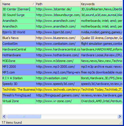
I may not read filenames as a pastime, but sometimes I would like to scan the titles, descriptions and keywords I've entered into my bookmark manager (the screenshot is of Linkman). Note the position of the horizontal scrollbar: there's a lot of information you aren't seeing. And if you scroll to the right, you won't see the leftmost part. And note also that few websites have titles as short as those used to make this particular screenshot. More often you'd only see the first three words of a much longer title. Meanwhile, other items, like tags and rating, are hidden.
And no matter how much you widen the window and resize the columns, sooner or later you'll have to scroll to the right, because a typical view in a bookmark manager looks more like this:

(This one taken from my own VisitURL. Silly me, I put the URL column first, which adds to the aggravation!)
One more example of what I think is abuse of listview - or abuse of the horizontal scrollbar. This is a task view from (my favorite) Calendarscope:
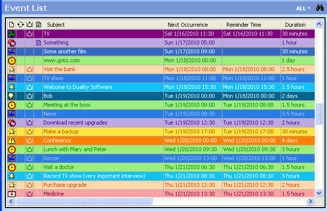
There are eight (8) more columns hidden behind the horizontal scrollbar here. And again, while not all those columns may contain lifesaving information, they are there and I'd like to see them... sometimes. Call it idle curiosity.
By contrast, here's where I think listview has been used properly. It doesn't appear as though you'd ever need to scroll or even resize the columns (there are only two):

(Found on Google Images - I don't know what application this is).
Listview is everywhere:
see for yourself. Or click on that green uTorrent icon in your system tray and count the columns you're not seeing.
So today... I'm staging a walkout. A strike. A protest on the virtual hi-tech highway. Heck, a whole e-riot! Please do not abuse the listview. Please, developers, reduce the amount of horizontal scrolling you are subjecting users to. Please don't hide potentially important information behind the edge of my screen.
If you let users type more than two or three words into an edit box, listview is not the proper control to display those words. If you have more than two or three columns hat can contain a stretch of text, listview is not the proper control to present those columns. There are better ways.
Ah, alternatives. Let them speak for themselves:
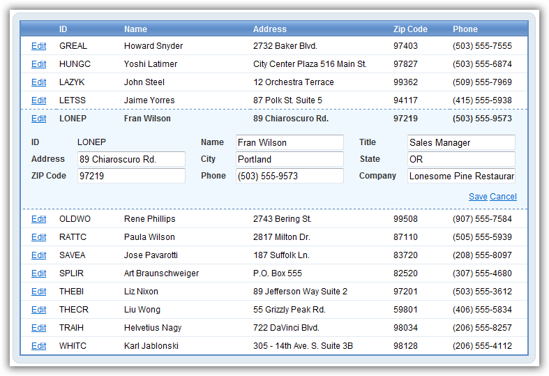
Microsoft LiveWriter (via Google Images). It still looks as though it has more columns than can fit, but note that when you select an item, you can see all of its data without scrolling. And you can edit all fields, too! Is it really easier to do so in Ajax than in C++? (Heh, could be!)
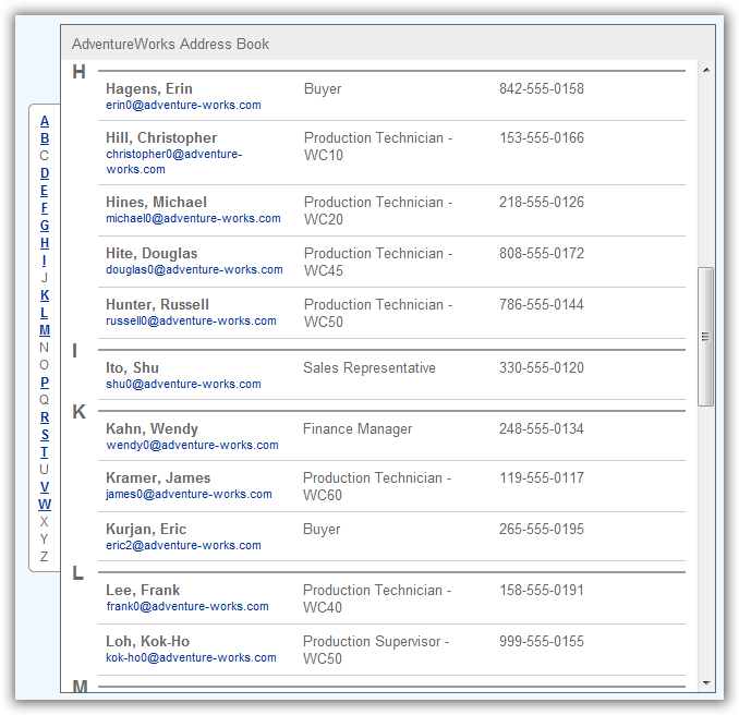
Nice! Google images again - this was described as ".Net 3.5 listview". Looks like MS can get it right on the desktop too, then! But have you ever actually seen it used?
Or how about this familiar view? Not editable, granted, but there's room for buttons, checkboxes and what not:

By far my favorite implementation is this solution from Copernic (the Internet search edition, screenshot a few years old now):
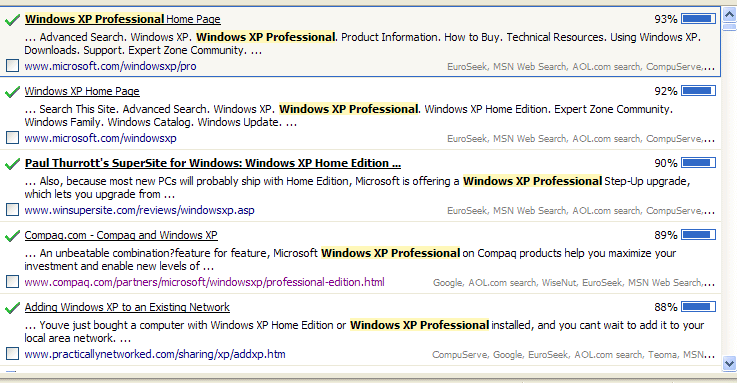
Look ma, no scrolling! Just wrap the text. Clean, beautiful, highly readable, and will accommodate any amount of data you care to put in there. You can even grow the font size without any text spilling over the edge. I so love this!
Another one Google Images threw up, I don't even know if this is Windows...
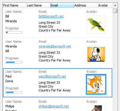
... but it's exactly what I'm after.
The problem with the listview is - it does so much and is so good, many developers are quite happy to have it for free, and many don't look beyond. I know I didn't.
What do you think? Can we banish the listview, with the endless scrolling and hiding of information? And will mouser kick me out for these outpourings of verbosity and bandwidth-eating screenshots?
