Even though I'm sure Mouser will know what I'm posting about I'll spell it out for anyone else who wants to throw in their 2 cents worth. One of the side effects of LBC's functionality vs aesthetics bent is a relative lack of styling-type options. I think that's fine. It doesn't stop me from making a nice looking toolbar. If I wanted 3D animation I'd watch a cartoon.
Just for the sake of reference I'm including some screengrabs from my launchbar so it's clear what I'm talking about. I intentionally didn't resize it so it would be easier to see things at roughly the same scale I am. There are also smaller ones below to illustrate particular points. I made sure to include the mouse pointer in the images.
 Width, spacing and padding (Oh my!)
LBC could use at least a basic option for padding the edges of nodes for a number of reasons. The first is admittedly just because it looks nice. I'm not saying everybody cares about it but honestly most people do even if they don't understand why. Preferring symmetry is an evolutionary advantage because if one half of a person's body is very different from the other they're likely to make a poor mate. I don't really want to mate with my launchbar but having buttons of wildly different sizes kind of bugs me.
My current solution:

My proposal is an option to add X pixels of padding to the edges - ideally with the option to pad the left and right sides differently than the top and bottom. It could even be per side but even I think that's excessive. The mouseover highlights could then start at the padding rather than the icon which also has a visual advantage. It's a lot easier to make out the icon or text if it's not covered with your pointer.
Currently I simply put extra spaces before and after the caption text to stretch the node boundaries. Of course it's difficult to get them close to the same size without a lot of trial and error.

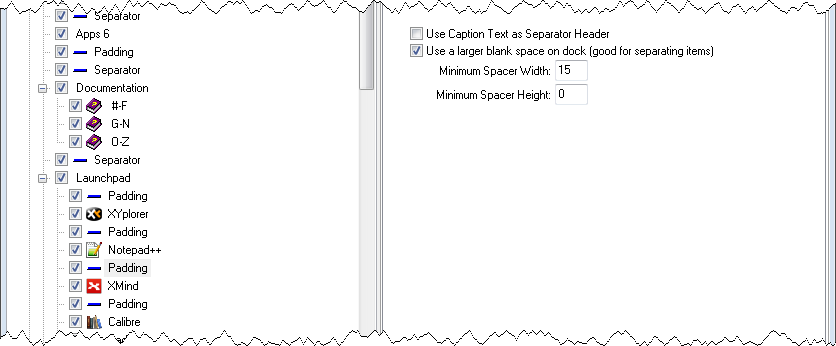
It also doesn't work when the caption isn't being displayed. Besides the issue of the mouse pointer, this results in very small spaces in between. Once again not always a problem but it can be. Particularly when you're using small icons but also if 2 adjacent icons are similar or even if you're just not overly familiar with the shape. I've been using separators but that's not really ideal either since a) it means a lot of separators and b)they seem to have a minimum size of 10 pixels when used that way.


Padding the top and bottom isn't all that important but if it's no extra work it would look a little nicer IMO. For example it would move the icons on mine further down from the top edge. This really is just looks though and not something I would even ask for by itself.
The other problems I hinted at on IRC actually turned out to be almost entirely side effects of the kludges I recently did away with. However as I was doing a little more kludge removal today I ran across another one I'd forgotten.
Because of the different visual styles my bar uses for different sections I thought it would be nice to have finer control over the caption font. I was hoping I might be able to do that using Link nodes but that turned out not to be the case. I still like the concept though and I thought I would go ahead and move my main menu set and help file menus to their own docks anyway.
Unfortunately it didn't work for the help menus because I couldn't get them to use small icons any more. The parent menu is set to small icons for child nodes, the link nodes were set to small captions, and I even set the original menus which were now in a separate dock to small icons. No matter what it doesn't work. It's not a big deal since I can just leave them where they started. Don't spend a bunch of time troubleshooting it or anything.
