I tried this once, with my Find and Run Robot application.
In that case I had the options dialog toggle between an Advanced mode, which shows all options, and a Simple mode, which hid most.
First let me say, I am a complete believer in the concept that too many options can be overwhelming, scary, and make it harder to find the options to do what you want.
Having said that, most people who have seen my software know that I simply cannot help myself when it comes to adding options, and they tend to proliferate in my software. I think that has to do partly with the audience. I tend to respond most to people who are tinkerers and like to customize things, and the DC forums tend to attract such people. And I don't spend too much time thinking about "How can we make this easier for new casual users."
Now back to the story of two modes in FARR: Eventually I dropped the idea of having the Advanced and Simple modes, simply because it did not seem like something that felt unsustainable for me -- hiding options in the dialog just never looked right.
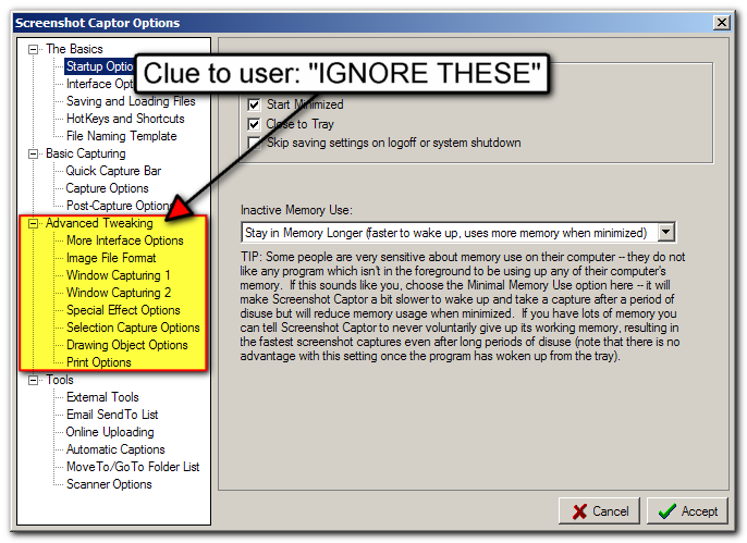
However, that was before I moved to my more standard TABBED options dialog which I have taken to using on most of my applications these days. I think the TABBED options offers a fairly natural way to move Advanced options to a separate section of tabs, and keep the more basic stuff in other tabs.
It's still not a perfect separation, but I think it can serve an important role in helping people see which options are more likely to be useful to them. A sample from the new Screenshot Captor options dialog:

This Advanced group is something I will probably add to my other programs as well. The only disadvantage is that it means some options that would otherwise logically be grouped together may get separated (some in basic options and some in advanced), but I think that's a price worth paying.
