topbanner_forum
  *

avatar image

Welcome, Guest. Please login or register.
Did you miss your activation email?

Login with username, password and session length
  • Saturday December 14, 2024, 5:20 pm
  • Proudly celebrating 15+ years online.
  • Donate now to become a lifetime supporting member of the site and get a non-expiring license key for all of our programs.
  • donate

Poll

Ampa's website is…

Crisp, bright, elegant, sophiticated
2 (22.2%)
Dull, sludgy, dark, unattractive
6 (66.7%)
Neither (please explain below)
1 (11.1%)

Total Members Voted: 9

Author Topic: Website colour: crisp and bright OR dull and sludgy  (Read 4811 times)

Ampa

  • Charter Member
  • Joined in 2005
  • ***
  • Posts: 592
  • I am cute ;)
    • View Profile
    • MonkeyDash - 2 Player strategy boardgame
    • Donate to Member
Website colour: crisp and bright OR dull and sludgy
« on: January 01, 2008, 10:29 AM »
Over Christmas I whipped up a small website for a local community hall. On my twin LCD displays the colours look crisp and bright, but on my mum's old CRT they look dull and sludgy (particularly in the top right hand corner).
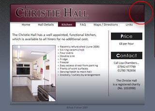
Christie Hall website.png
Click to visit site

Now I am worried that the majority of people may be seeing the ugly version!

Please take a quick look for me and then vote above!

Thanks.

PS: anybody know the 'right' way to avoid colour discrepancies between systems. I have always assumed that my screen is giving me an accurate representation of what I have designed.
« Last Edit: January 01, 2008, 10:31 AM by Ampa »

justice

  • Supporting Member
  • Joined in 2006
  • **
  • Posts: 1,898
    • View Profile
    • Donate to Member
Re: Website colour: crisp and bright OR dull and sludgy
« Reply #1 on: January 01, 2008, 10:52 AM »
re ps: If you have adobe  photoshop, run adobe gamma from your control panel to setup your system. otherwise: read along at http://www.normankor...ingfineprints1A.html

tomos

  • Charter Member
  • Joined in 2006
  • ***
  • Posts: 11,964
    • View Profile
    • Donate to Member
Re: Website colour: crisp and bright OR dull and sludgy
« Reply #2 on: January 01, 2008, 12:28 PM »
afraid it looks dull (but I wouldnt go as far as sludgey) on CRT monitor all right
(voted for "dull &..")
Tom

mouser

  • First Author
  • Administrator
  • Joined in 2005
  • *****
  • Posts: 40,914
    • View Profile
    • Mouser's Software Zone on DonationCoder.com
    • Read more about this member.
    • Donate to Member
Re: Website colour: crisp and bright OR dull and sludgy
« Reply #3 on: January 01, 2008, 01:02 PM »
it's very elegant.. but i would say it's a bit dark, especially for a page featuring a kitchen/house.  people tend to want BRIGHT kitchens, so maybe some brightening is in order.

p3lb0x

  • Supporting Member
  • Joined in 2007
  • **
  • Posts: 424
  • Beer, beer, beer, I'm going for a beer!
    • View Profile
    • Donate to Member
Re: Website colour: crisp and bright OR dull and sludgy
« Reply #4 on: January 01, 2008, 01:55 PM »
I would go for "dull and dark"
Stop mousering people so much - Mouser