topbanner_forum
  *

avatar image

Welcome, Guest. Please login or register.
Did you miss your activation email?

Login with username, password and session length
  • Thursday March 28, 2024, 9:55 am
  • Proudly celebrating 15+ years online.
  • Donate now to become a lifetime supporting member of the site and get a non-expiring license key for all of our programs.
  • donate

Author Topic: Gothic's New Blog on Server Administration and a cool console-y wordpress theme  (Read 15035 times)

mouser

  • First Author
  • Administrator
  • Joined in 2005
  • *****
  • Posts: 40,896
    • View Profile
    • Mouser's Software Zone on DonationCoder.com
    • Read more about this member.
    • Donate to Member
Everyone here knows John S. (aka Gothi[c]) who does such an amazing job admistering the donationcoder servers (both the main server and the newly upgraded member server).

Well he's finally been convinced to start a blog (sorry! i meant "web log") talking about server administration issues.  It's pretty hairy stuff but makes for great reading.  Since he's a bit reluctant to toot his own horn I'm here to let you all know about it.

Of course those of us who know John know that he's never content to just use something as he finds it.  Naturally then he decided to create a unique wordpress theme that bears an uncanny resemblance to an old fashioned green text terminal.  It's a very cool effect, and one of the more unique Wordpress themes i've seen.  And of course knowing John you already know that he made the theme available for download under the GPL on the blog, so you can go get it there.


Gothi[c]

  • DC Server Admin
  • Charter Honorary Member
  • Joined in 2006
  • ***
  • Posts: 873
    • View Profile
    • linkerror
    • Donate to Member
Well he's finally been convinced

More like, pushed nagged, prodded, poked and shoved into compliance by mouser :lol: He gives me too much credit. :)

The theme has had some minor changes since the tarball I uploaded there. I'll just create a section for it on linkerror.com where updates can be grabbed from.
It's a very minimal theme though. I got rid of many if not most wordpress features because they would be too crowding or not needed.

nudone

  • Cody's Creator
  • Columnist
  • Joined in 2005
  • ***
  • Posts: 4,119
    • View Profile
    • Donate to Member
very clever idea for a theme. top marks there.

(i shall have proper read through the web log later.)

Josh

  • Charter Honorary Member
  • Joined in 2005
  • ***
  • Points: 45
  • Posts: 3,411
    • View Profile
    • Donate to Member
Cool! Almost as clever as the website design I just had developed for my wife! Good job Goth!

40hz

  • Supporting Member
  • Joined in 2007
  • **
  • Posts: 11,857
    • View Profile
    • Donate to Member
Love the look.  :-*  Reminds me a bit of the theme used at this website:

http://retro.kerrywebster.com/

retro.jpg

I like what you've done much better.

I always wanted to theme a a hardcore tech website with this sort of look. But the, um....reaction I got from everybody I showed the mock-ups to convinced me that maybe I'd better not.

Thanks for letting me live vicariously through your blog's theme John S.! ;D

« Last Edit: April 16, 2009, 08:46 AM by 40hz »

Veign

  • Charter Honorary Member
  • Joined in 2005
  • ***
  • Posts: 993
    • View Profile
    • Veign - Where design meets development
    • Donate to Member
I really wish I could read it but that color makes it almost impossible for me.  I can only make it a few words before needing to look away.

40hz

  • Supporting Member
  • Joined in 2007
  • **
  • Posts: 11,857
    • View Profile
    • Donate to Member
I really wish I could read it but that color makes it almost impossible for me.  I can only make it a few words before needing to look away.

symp.gif


Spend at least half my computing hours in MonoAmber-Land now that I think about it. 8)
« Last Edit: April 16, 2009, 04:33 PM by 40hz »

Gothi[c]

  • DC Server Admin
  • Charter Honorary Member
  • Joined in 2006
  • ***
  • Posts: 873
    • View Profile
    • linkerror
    • Donate to Member
I really wish I could read it but that color makes it almost impossible for me.  I can only make it a few words before needing to look away.

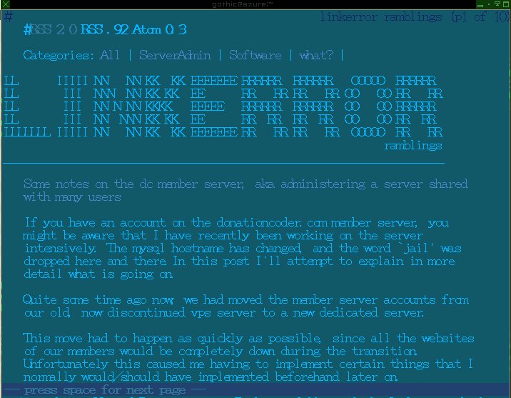
if green on black doesn't make you warm and fuzzy, then the posts probably won't be for you to begin with. :)

That said, you can view it in a text-browser and use any colors in your terminal you want. That's why I made it text-browser friendly :)

Here it is in lynx, with a lower contrast, just by editing the terminal colors:

lynx.jpg

Honestly, I really dislike browsing the internet. I can't stand looking at white backgrounds, they make my head hurt, and that's what popular on the net for some reason.
In my point of view, web DESIGN is the worst thing that ever happened to the net. Web pages have become similar in design to paper magazines, from typography, images, to even the white paper.
Javascript, flash, web2.0 mirror backgrounds, big banner images, all the commercialism. It all just makes the http:// very unpleasant for me. I know that the rest of the world probably feels the opposite, but oh well... :) That's why I am not a web designer. :D I couldn't stand it. I'd rather die than bowing to my client's wishes.
I can hear them coming already: "I WANT A BLINKING THINGY WITH MUSIC!"...

Now we have to worry about css hacks, browser compatibility, and apparently even colors... I really think we'd be better off with plain text, and let any one use any colors they want in their browser. One size does not fit all. Never-ever.

And that's what web-design has done to us. Forcing a particular design upon us. If I change my browser background to black, for example, half the sites on the internet become unreadable because some sites force black text, and you can't read black on black.

If I force both foreground and background colors in my browser, then things look ugly as all hell, because of websites using images with bright colors in their design, which would directly clash with my settings.
I imagine people with accessibility issues face the same thing every day.

The web should be about content. Leave design to the realm of physical paper magazines. Let users use whatever setting they want in their browser.

Many, if not most things I do are done from my terminal window, making all applications look uniform, with the same colors etc... Every time I fire up a web browser, my choice, my preferences, my settings, they all go out the window because of some bloke that thought it'd be fun to give content a 'design'.

Nothing personal, Veign! You're still a great person :D Rant was against state of the www, not an attack on your profession ;)

All of it is just personal opinion which is subject to error and change, and so out of sync with the world that it's not even funny. Often I think these things and don't rant about them, because ranting about them seems so pointless. All I'm doing is telling people I'm a weirdo :D See first post on the linkerror ramblings site for disclaimer :D
« Last Edit: April 16, 2009, 07:06 PM by Gothi[c] »

tinjaw

  • Supporting Member
  • Joined in 2006
  • **
  • Posts: 1,927
    • View Profile
    • Donate to Member
I just got to work and haven't even had my first sip of coffee yet, but I had to take a moment to say that I agree with you Gothi[c] about web design for the most part.

I often grab RSS feeds instead of going to a website so that I can control how the information is viewed.

However, I do understand why a fashion website or a music website would want to be fancy, because that is their audience and the information that most of their audience wants is colorful photos and fancy design.

But, for generic news or reference information, yeah, I wish we could greatly simplify things.

And I have always be against white background. I can't understand why people want to stare into a bright light.

Veign

  • Charter Honorary Member
  • Joined in 2005
  • ***
  • Posts: 993
    • View Profile
    • Veign - Where design meets development
    • Donate to Member
Nothing personal, Veign! You're still a great person :D Rant was against state of the www, not an attack on your profession ;)


Nothing personal taken.  I think the thing most people forget is not everyone sees things the way you do - I'm colorblind and that color combination is about as comfortable as ramming shards of glass in my eyes.

Also, I completely disagree with you about the web is better off as text or removing the design element.  I find it difficult to believe than anyone truly believes that whats available (websites) through the internet nowadays would be better off by removing the design part.  Agree to disagree.

FYI: I have the utmost respect for Gothi[c] and recommend him to my clients for anything server related.

mouser

  • First Author
  • Administrator
  • Joined in 2005
  • *****
  • Posts: 40,896
    • View Profile
    • Mouser's Software Zone on DonationCoder.com
    • Read more about this member.
    • Donate to Member
i agree with veign mostly (and almost always).

as much as i have a love-hate relationship with css and html, i wouldn't want to go back to a text-only internet.

i also simultaneously think gothic's wordpress theme is super cool *and* hard on the eyes.

ideally it might be nice to offer a switch so user could view it in a more human-friendly format  :P

Veign

  • Charter Honorary Member
  • Joined in 2005
  • ***
  • Posts: 993
    • View Profile
    • Veign - Where design meets development
    • Donate to Member
Create a Sell-Out switch where it makes the blog look like every other designed blog.  Then he could put a big warning before people like me switch it  :)

Gothi[c]

  • DC Server Admin
  • Charter Honorary Member
  • Joined in 2006
  • ***
  • Posts: 873
    • View Profile
    • linkerror
    • Donate to Member
Well, I'm fully aware that my preferences are not most people's preferences, I hope I made that clear. That's why I stressed that 'one size fits all' never works.

Gothi[c]

  • DC Server Admin
  • Charter Honorary Member
  • Joined in 2006
  • ***
  • Posts: 873
    • View Profile
    • linkerror
    • Donate to Member
.. Of course, the opposite is true as well:
Why should I make a switch button when 99% of the internet that makes MY eyes hurt doesn't have one.

steeladept

  • Supporting Member
  • Joined in 2006
  • **
  • Posts: 1,061
    • View Profile
    • Donate to Member
Personally, the colors don't really bother me much.  Maybe that comes from looking at a D#$! mainframe terminal 8+ hours a day.  Don't mind the terminal, it is easy to read and see all relevant information (not to mention prioritization with the 7 color format we use) - it is the Z/OS I hate dealing with!

40hz

  • Supporting Member
  • Joined in 2007
  • **
  • Posts: 11,857
    • View Profile
    • Donate to Member
.. Of course, the opposite is true as well:
Why should I make a switch button when 99% of the internet that makes MY eyes hurt doesn't have one.


wow! kinda harsh...


« Last Edit: April 20, 2009, 02:26 PM by 40hz »

Gothi[c]

  • DC Server Admin
  • Charter Honorary Member
  • Joined in 2006
  • ***
  • Posts: 873
    • View Profile
    • linkerror
    • Donate to Member
wow! kinda harsh...
I don't know :) My initial idea was making it black-on-black so nobody can read it! (without selecting the text or viewing it in a text browser)

Maybe I should do a browser detection. If javascript is enabled:
" Error. Javascript is enabled. Please use a browser without javascript support. "

(Like the reverse of what some sites do)

cranioscopical

  • Friend of the Site
  • Supporting Member
  • Joined in 2006
  • **
  • Posts: 4,776
    • View Profile
    • Donate to Member
My initial idea was making it black-on-black so nobody can read it!
Less a theme than a black whole.