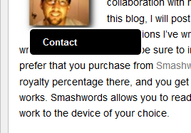
Not really, floating menus that you can't get rid of are one reason to avoid a site AFAIAC.
ie. It obscures content, which is what I visit a site for - if I have to keep scrolling around just to read what's under something that really doesn't need to be there, then I won't go to that site.
Is there really anything wrong with a button at the top and bottom?
I know it's only my view, (and to be honest I don't visit blog sites anyway), but in the end you are trying to promote your book/writing which kind of makes it commercial - and
very rarely have I seen any commercial site that willingly obscures what they're trying to sell.

And it's actually bigger now.

