Hi Stoic Joker,
thanks for pointing me to this thread via email.
I just installed TClock 2010 on my Win7x64 and it works perfectly (even the secret hidden it-which-must-not-be-named feature).-xcopy
LOL

...Good man.
Just one thing, compared to your TClock x64 1.01 which I used up to today:
when I use the same font settings for the Clock text the new text is way to bold even when bold is not selected (when it is, it goes ultra-creamy-bold).
This is what v1.0.1 displays with Verdana, 9pt, not bold:

T-Clock 2010 (download)
And this is the same setting with v2010:

T-Clock 2010 (download)
Actually it looks like ClearType was enabled but it's not.
Is there a way to make the text brilliant sharp like it used to be (please  )?
)?-xcopy
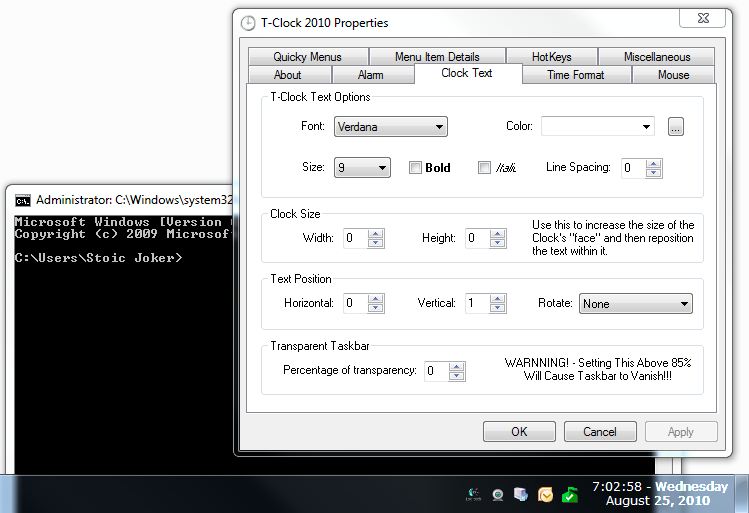
Well... Here's where I'm at (surprised nobody caught this before). I made a change in the way T-Clock creates its-own font at runtime that effectively creates a ClearType font (I was/am debating on making this a configurable option). The native Taskbar transparency is whats queering the deal here, because if you have a dark background the fonts look fine. White or pale backgrounds make the font appear to fuzz.
As an example of this behavior:

Notice it's crystal clear over the command prompt, but it gets fuzzy over the white?
I'm guessing from your screen-shots that you have a light-ish colored wallpaper, Yes?
If you can replicate the test, and confirm this behavior, I'll add including a toggle to the To-Do list so T-Clock's use of ClearType can be disabled internally. *Shrug* ...It seemed like the thing to do at the time - I was shooting for crisper fonts on a dark background - But I have been wrong before...

P.S. (Almost forgot) From your screen-shots, it looks like you need to increase the clock height setting a bit (+2 should do) so it stops cutting off the bottom of the g's
