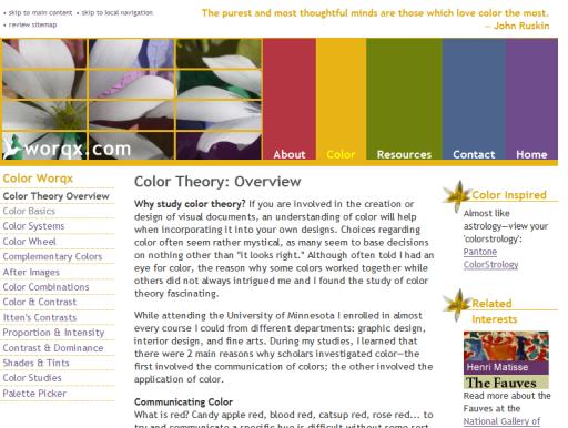
Found a fascinating color theory tutorial, including links to additional resources and a bibliography:
http://www.worqx.com/color/
This is general stuff, easy to read and organized so that it's amenable to topic hopping. It's applicable to paper documents, application & web design, or simply making sure your chosen Windows color palette won't give you a siezure.
Simply reading the section about Perceptual Opposites led me to an "aha!" moment, when I finally understood
why some colors just look nasty together, like they want to vibrate each other off the screen. I'd subconciously recognized the phenomenon, but now I know why that happens.
Unfortunately none of this will not stop Mrs. Maximus from painting the kitchen green.
