In my humble knowledge, Google required a very bare minimum interface for its Android, as cheap mobiles have less power and battery. More the graphics more the strain on CPU and battery. Then MS copied it for its Win10, same reason for its WinPhone and Surface tablet. It is like having sheets of paper with text written on them. Some may have different color or a box drawn around them but most are just plain text.
But for God's shake, think of desktop users. We do not have problem with cpu and battery.

I really feel pissed off when I have to waste time just touching clicking at all places in finding the place which will act like a "Button"!!!

See the few screen shots attached.
 Why material design was designed !!
 Why material design was designed !!
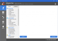 Why material design was designed !!
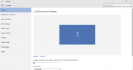 Why material design was designed !!
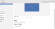 Why material design was designed !!
In IOBit Uninstaller, CCleaner and MS Settings. We can clearly see that in trying to be material design friendly, they give us high time in playing the game of puzzle to find out which "text" clicked will do what ??
Setting taking so much screen space that it has to be scrolled to get further options, which could have fit in one screen itself. Then blue text is button (Identify) but the bix blue box with 1 is not. ( I have clicked it many times)
CCleaner tab page highlight is reverse, the grey one is not the active tab page.
IOBit needed me couple of time before I understood how to click to uninstall a program. I am not taking about the big circle below, but the program list lines.
Second image of IOBit showing another window over the first one, but looks like it is one window and can not be moved.
In my Android phone, many are becoming material design and I understand their problem and I have to manage there but I do not want to play game on my desktop. Please give me back my buttons, bevel, shadows.
Regards,
Anand

