Light on dark, of course. You dark on lighters (hmmm... darklighters. Where have I heard that before...) I can't figure out... the abundance of white blinds me... I severely dislike the theme for DC because of that... when I come here, I'm blinded for a few secs, LOL!
-wraith808
Fascinating. It just shows we see things differently

In your screenshot, the light grays are unreadable to me due to low contrast, I have to strain my eyes and they sink into the background. The white text, OTOH, produces a contrast that's much too high - it's readable but also headache-inducing.
I could live with the light grays, but only if using bold font, to add body to the character glyphs, and I would want to brighten them up a bit (though not to pure white).
In general, I cannot be comfortable with pitch-black backgrounds, since whatever text colors I use, the contrast is either too high or too low. Red on black or blue on black, as in some of the previously posted screenshots, is just illegible to me. I think that black tends to overpower the relatively thin squiggles of text, it seems to weaken all other colors, while white brings other colors out. Gaming sites - I can never read text on gaming sites, as they all tend to use black BG. Which, come to think of it, is probably a good thing!
On the other hand, pure white background blinds me as much as anyone. The first thing I do after reinstalling the sytem is reduce the whiteness. This is my default background, RGB 210/210/210:

Note the sparingly used syntax coloring. Apart from TextPad, the only editor I've found that lets me color the angle brackets but not their contents is EmEditor, and I love it that way. I use this color scheme everywhere, which means some funky looking websites, where the designers neglected to specify default BG color, producing a gray background with irregular patches of white. One of the easiest ways to tell crummy web design
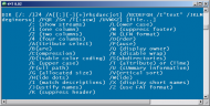
And I experiment a little when using console tools. I avoid black, but also want the console to look different than regular windows (a nostalgic throwback to old-school monochrome monitors), so I've come up with these two schemes that work well for me:
My favorite shade of ink-blue:
And light gray on green is nicely legible, too, as Mouser noticed above:
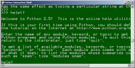
(The font is Lucida Console bold)

 Recent Posts

 Although, like tinjaw, I'm already using a number of these great apps, which makes my choice a little easier.