
 Recent Posts
2876
Living Room / On websites: why do sans-serif fonts sometimes look great, sometimes not?
« Last post by superboyac on February 01, 2011, 01:01 PM »I've dabbling with tweaking my website look. I like tranglos' site very much, see here:
http://ethervane.com/
Anyway, that's besides the point. What I don't really understand is how come the sans-serif fonts sometimes look good in browsers, and sometimes they don't? There's something weird there. I normally tend to prefer the sans-serif fonts like helvetica, arial, calibri, verdana...but when it goes on the website, something happens that I don't always understand.
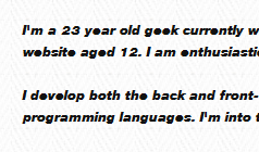
So if you look at my site right now, you'll notice that the normal text has a jagged look about it:

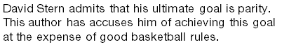
How can I get those characters to be more smooth? More of a "cleartype" look? Another thing I've noticed is this thing:
Why does that happen? I think those sites are intended to look good on macs, and not pc's.
What I would really like the font to look like is more of what we see with the fonts on Word (or any word processor):
Actually, that doesn't look as good as I expected. Maybe it's this XP computer I have at work. I think these all looked better at home on my Windows 7 computer.
The end goal of all this: what is the best sans-serif font(s) for me to use for a website? but I don't want to turn this into another best fonts discussion. i want to address the specific questions above.
http://ethervane.com/
Anyway, that's besides the point. What I don't really understand is how come the sans-serif fonts sometimes look good in browsers, and sometimes they don't? There's something weird there. I normally tend to prefer the sans-serif fonts like helvetica, arial, calibri, verdana...but when it goes on the website, something happens that I don't always understand.
So if you look at my site right now, you'll notice that the normal text has a jagged look about it:
How can I get those characters to be more smooth? More of a "cleartype" look? Another thing I've noticed is this thing:
Why does that happen? I think those sites are intended to look good on macs, and not pc's.
What I would really like the font to look like is more of what we see with the fonts on Word (or any word processor):
Actually, that doesn't look as good as I expected. Maybe it's this XP computer I have at work. I think these all looked better at home on my Windows 7 computer.
The end goal of all this: what is the best sans-serif font(s) for me to use for a website? but I don't want to turn this into another best fonts discussion. i want to address the specific questions above.
 That's nice, but I'd be expecting some folks to get way bigger numbers there than would fit in the standard badge icons we currently have

