Right. It does look orange. Looks like that just has to be accepted, what a pity (if I ever find time I'll see if there's some way to calibrate the touchscreen differently; I really can't see any good reason why it is so poor - "touch enabled" doesn't equate to "crap colours").
Anyway, it's a long process but I'm starting to put together proper WinButton layouts. I've just put a 30 button layout together, believing that 40 buttons was way too many, but now I realise I really do need 40 buttons (or even more).
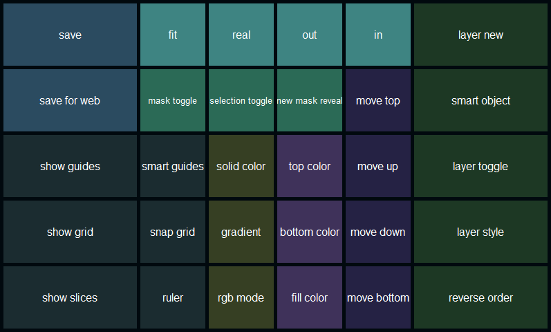
Here's an example of the "metro" Photoshop layout - which I'll have to change to add more buttons to. Oh well. I've got Adobe Illustrator and Adobe Premiere layouts to do in a similar style (colours changed to match Adobe's icon colour scheme). After that I'll record and upload the video I said I'd do, demonstrating how things work.
edit:
may as well attach the actual WinButton template too if anyone want to try it. Some of the buttons won't work unless you create the very same keyboard shortcuts in Photoshop.

 Recent Posts

