topbanner_forum
  *

avatar image

Welcome, Guest. Please login or register.
Did you miss your activation email?

Login with username, password and session length
  • Tuesday March 19, 2024, 5:27 am
  • Proudly celebrating 15+ years online.
  • Donate now to become a lifetime supporting member of the site and get a non-expiring license key for all of our programs.
  • donate

Author Topic: Against ellipsis ... (dot dot dot)  (Read 19222 times)

Nod5

  • Supporting Member
  • Joined in 2006
  • **
  • Posts: 1,169
    • View Profile
    • Donate to Member
Against ellipsis ... (dot dot dot)
« on: April 04, 2009, 04:18 AM »
In graphical user interfaces (GUIs) an ellipsis is the three dots ( ... ) inserted when a filename, webpage title or other information item is too long to fit in a tab, windows title bar or other area of the screen. The ellipsis dots signals that there's more information available. That can be useful. But the ellipsis are almost always redundant. They're most often a bad waste of screen space. Remove them and make the world a better and more efficient place!  8)

The basic problem is that ellipsis are used where other objects already show users that long information is cut off. The ellipsis is redundant! Some examples:

Firefox 3:
ff.png
Each tab is separated by a few pixels with another color. So even without ellipsis users would still easily separate the tab texts and would still know when a tab title is cut off. "SourceForg" would be more helpful than "SourceF..."

Internet Explorer 7: the exact same problem as in Firefox
ie.png

Windows Explorer: the vertical line separating the columns and the difference in column background color (grey/white) already tells that information may be cut off.
expl.png

In these and other cases the ellipsis just hides three letters that could have displayed useful information without adding anything of value. That is bad GUI design! Since ellipsis remove valuable information they should be used ONLY when there's no better (less screen space wasting) way to tell the users that information cut offs may take place i.e. almost never.

Now let's zoom out. Browser tabs is probably one of the most read information area in the world. Every day billions of tabs are opened, read and clicked. Then it is EXTREMELY WASTEFUL to not optimize them by removing all screen space wasting parts. In single cases the problem might seem very small. Ok, now and then a tab ellipsis makes it hard for a users to see which tab is which. So what? The user just clicks the tab to check it. It only takes half a second! Sure. But now scale that up globally to 1 billion instances. That's 17361 8 hour work days wasted! So if my suspicion that the ellipsis wastes some time for most users is correct then the problem adds up to great global inefficiency.

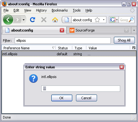
Can we fix this? For end users the ellipsis are sometimes hard or impossible to disable. I have found no way to do it in IE or Windows Explorer. Here's a 2/3 solution for Firefox:

1. enter "about:config" in the Firefox adress field
2. then filter for "ellipsis"
3. doubleclick "intl.ellipsis", in the popup box remove "..." and enter " " (a space).
4. restart Firefox
about.png

But a complete and global fix can only come at the developer level. The Firefox devs should disable ellipsis by default.

The FF devs should also consider space optimizing the tabs and GUI in other ways too. In the meantime users can do that themselves.
1. Disable unused toolbars (remove unneeded buttons and combine them on a single toolbar).
2. use small icons
3. Install the add-on Stylish https://addons.mozil...S/firefox/addon/2108 and use the styles below (with slight tweaking) from http://userstyles.org/ to compact the toolbars, tabs and allows more information in each tab.
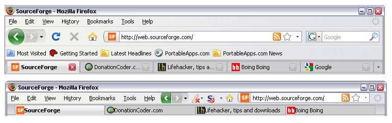
before & after:
bef_aft.png

I've combined all the used userstyles into one pack:
compact toolbars, buttons, tabs [multi style pack]
http://userstyles.org/styles/16643

List of included styles (all cred goes to the original scripters!):

by barbiegirl:
TABS: Reveal More Text When Click Icon
http://userstyles.org/styles/15433

Tabs: Move Text Closer To Icon and Closebutton X
http://userstyles.org/styles/16529

TABS: More Text Space - Move Icon to Far Left
http://userstyles.org/styles/14967

TABS: More Text Space - Move CloseButton X Right
http://userstyles.org/styles/14960
--------
by izzy:

FF3 Toolbar Resize
http://userstyles.org/styles/9220
--------
by ben:

Custom Tab Bar Height on Firefox 3
http://userstyles.org/styles/7869

Do you know of more ways to disable unneeded ellipses? Post a comment and I'll update this post with that info. To be continued...   :D
« Last Edit: April 04, 2009, 04:28 AM by Nod5 »

mouser

  • First Author
  • Administrator
  • Joined in 2005
  • *****
  • Posts: 40,896
    • View Profile
    • Mouser's Software Zone on DonationCoder.com
    • Read more about this member.
    • Donate to Member
Re: Against ellipsis ... (dot dot dot)
« Reply #1 on: April 04, 2009, 04:25 AM »
What an interesting and obsessive post.. I can see how this would be useful for people on small ultraportable, pda, phone,etc. browsers.

Nod5

  • Supporting Member
  • Joined in 2006
  • **
  • Posts: 1,169
    • View Profile
    • Donate to Member
Re: Against ellipsis ... (dot dot dot)
« Reply #2 on: April 04, 2009, 04:36 AM »
Well, a bit obsessive I guess ;D I thought it might be helpful to folks like me who often have A LOT of tabs open simultaneously. But sure, the smaller the device/resolution the greater the need for compactness and smart use of all screen space.

I think the ellipsis case also illustrates how software GUI dev must be refined as user computer literacy is improved. Maybe the ellipses was really needed earlier on to avoid confusion among users. But now most people are very experienced with browsers and how tabs work so ellipsis has instead become a nuisance. Compare to the nagging "are you really, really sure you want to close the window?" warnings that many of us opt to disable. It seems like fewer programs have such warnings by default nowadays. Maybe the ellipsis will similarly vanish in the future. The sooner the better I think.
« Last Edit: April 04, 2009, 04:42 AM by Nod5 »

mouser

  • First Author
  • Administrator
  • Joined in 2005
  • *****
  • Posts: 40,896
    • View Profile
    • Mouser's Software Zone on DonationCoder.com
    • Read more about this member.
    • Donate to Member
Re: Against ellipsis ... (dot dot dot)
« Reply #3 on: April 04, 2009, 04:42 AM »
is there a ff extension (i'm sure there must be) that lists open tabs in the sidebar?  that would be another way to tackle the issue since you should be able to show many more tabs lines there.

Nod5

  • Supporting Member
  • Joined in 2006
  • **
  • Posts: 1,169
    • View Profile
    • Donate to Member
Re: Against ellipsis ... (dot dot dot)
« Reply #4 on: April 04, 2009, 05:00 AM »
I don't know but that's worth checking out. Though it might be more distracting to have the tabs and adress field apart (to the left / at the top).

It is worth mentioning that the TabMixPlus add-on https://addons.mozil...S/firefox/addon/1122 can spread tabs over multiple lines when enough tabs have been opened. It can be fine tuned a lot.

mouser

  • First Author
  • Administrator
  • Joined in 2005
  • *****
  • Posts: 40,896
    • View Profile
    • Mouser's Software Zone on DonationCoder.com
    • Read more about this member.
    • Donate to Member
Re: Against ellipsis ... (dot dot dot)
« Reply #5 on: April 04, 2009, 05:09 AM »
Yep: TabMixPlus - Best Addon Ever.

f0dder

  • Charter Honorary Member
  • Joined in 2005
  • ***
  • Posts: 9,153
  • [Well, THAT escalated quickly!]
    • View Profile
    • f0dder's place
    • Read more about this member.
    • Donate to Member
Re: Against ellipsis ... (dot dot dot)
« Reply #6 on: April 04, 2009, 05:49 AM »
I personally like ellipsis - if I can't have the full amount of information, I'd much rather have an indication that parts are missing. It's not like three characters carry a lot of useful entropy if there's another 100 missing. When dealing with stuff like filenames, I tend to insert the ellipsis in the middle, though.
- carpe noctem

Eóin

  • Charter Member
  • Joined in 2006
  • ***
  • Posts: 1,401
    • View Profile
    • Donate to Member
Re: Against ellipsis ... (dot dot dot)
« Reply #7 on: April 04, 2009, 08:12 AM »
This isn't the first time these have been mentioned; https://www.donation...ex.php?topic=11405.0.

Personally I like them, they look more profession (or something) to me :)

tranglos

  • Supporting Member
  • Joined in 2006
  • **
  • Posts: 1,081
    • View Profile
    • Donate to Member
Re: Against ellipsis ... (dot dot dot)
« Reply #8 on: April 04, 2009, 09:34 AM »
When dealing with stuff like filenames, I tend to insert the ellipsis in the middle, though

I think this is crucial. Often with really long file/folder names, the distinguishing bits come near the end:

A really long folder with photos of dogs
A really long folder with photos of goats


Also, instead of three dots, developers could use the ellipsis character "…" (Unicode 2026; ANSI 133) - it's perfectly readable and usually not as wide as three separate dots. Usually: in Courier New the width of ellipsis is equal to the width of a single dot; in Times New Roman though three separate dots take less space, which surprised me. In Arial, three dots are minimally shorter, but in Verdana ellipsis is better.

Other than that, I'm OK with ellipsis.
« Last Edit: April 04, 2009, 09:38 AM by tranglos »

fenixproductions

  • Honorary Member
  • Joined in 2006
  • **
  • Posts: 1,186
    • View Profile
    • Donate to Member
Re: Against ellipsis ... (dot dot dot)
« Reply #9 on: April 04, 2009, 10:03 AM »
2f0dder
Can't agree more.

Hm, tranglos mentioned already that ellipsis is not "3 characters" :)

Nod5

  • Supporting Member
  • Joined in 2006
  • **
  • Posts: 1,169
    • View Profile
    • Donate to Member
Re: Against ellipsis ... (dot dot dot)
« Reply #10 on: April 05, 2009, 04:19 AM »
I personally like ellipsis - if I can't have the full amount of information, I'd much rather have an indication that parts are missing. It's not like three characters carry a lot of useful entropy if there's another 100 missing. When dealing with stuff like filenames, I tend to insert the ellipsis in the middle, though.
I agree about filenames for some (but not all) purposes. I like how the DC contracts long links for instance!

But for browser tabs specifically the available space is radically limited. The ellipsis can take up 50% or more of the information space if you have many tabs open. And we almost always get a sufficient indication that things are missing anyway, because (i) the tab border is reached and a new tab starts and because (ii) the text on the tab is a partial word or otherwise obviously cut off.

A drawback is some possible ambiguity: "SourceFor" COULD be both "SourceForge" with some letters missing or a site actually called "SourceFor". But I'm thinking that ellipsis doesn't help much in such cases either: "Source..." would not add more certainty. We'd still be unsure if it stands for "SourceFor" or "SourceForge" (or any other page titled "Source____" ).

Eoin: But professional how? I guess the ellipsis helps add space between information objects, just like the borders and space between tabs and the whitespace tab margins does. The compact, ellipsis-disabled alternative can look VERY compact. But at least my eyes adapted almost instantly to that. So I dare you to try FF without ellipsis for a week and then post again :D

fenixproductions/tranglos: Interesting! But Firefox seems to use three dots (see about:config part above), not a single special ellipsis-character.

edit:
BTW the thread Eoin linked ( https://www.donation...ex.php?topic=11405.0 ) describes another use of ellipsis that I'm fine with:
An ellipsis (...) at the end of a menu item indicates that an application needs additional user input to execute the item's command. An ellipsis indicates that the application will display a dialog box before executing the command. However, not all menu items that open additional windows should have an ellipsis. For example, the About item in a Help menu should not end in an ellipsis.
« Last Edit: April 05, 2009, 04:27 AM by Nod5 »

fenixproductions

  • Honorary Member
  • Joined in 2006
  • **
  • Posts: 1,186
    • View Profile
    • Donate to Member
Re: Against ellipsis ... (dot dot dot)
« Reply #11 on: April 05, 2009, 02:33 PM »
fenixproductions/tranglos: Interesting! But Firefox seems to use three dots (see about:config part above), not a single special ellipsis-character.

I've took a look and ellipsis is there (no 3 separate dots).
I checked that by hitting backspace: one hit -> all gone :)

cmpm

  • Charter Member
  • Joined in 2006
  • ***
  • default avatar
  • Posts: 2,026
    • View Profile
    • Donate to Member
Re: Against ellipsis ... (dot dot dot)
« Reply #12 on: April 05, 2009, 03:01 PM »
I like not having the dots in my tabs.
Here's two vertical tab bars if you are interested.
Wide screen monitors would be great for these.

https://addons.mozil...S/firefox/addon/8045

https://addons.mozil...S/firefox/addon/1343

Nod5

  • Supporting Member
  • Joined in 2006
  • **
  • Posts: 1,169
    • View Profile
    • Donate to Member
Re: Against ellipsis ... (dot dot dot)
« Reply #13 on: April 07, 2009, 01:33 PM »
fenixproductions: You're right! Weird -- I was so sure that it was three separate dots when I checked.  :-[

cmpm: thanks, I'll testdrive with vertical tab for a while.

app103

  • That scary taskbar girl
  • Global Moderator
  • Joined in 2006
  • *****
  • Posts: 5,884
    • View Profile
    • Donate to Member
Re: Against ellipsis ... (dot dot dot)
« Reply #14 on: April 08, 2009, 10:32 AM »
This is one of the reasons why I keep my taskbar on the side and not the top or bottom, and fully extended.

Compare:

The way I keep it:
SNAG-00243.pngAgainst ellipsis ... (dot dot dot)

Now look at the button for this page on your taskbar. (assuming you have it the standard way).

Eisen

  • Participant
  • Joined in 2013
  • *
  • default avatar
  • Posts: 1
    • View Profile
    • Donate to Member
Re: Against ellipsis ... (dot dot dot)
« Reply #15 on: November 30, 2014, 08:06 AM »
Thank you for sharing. Those dots on browser tabs are so annoying.