


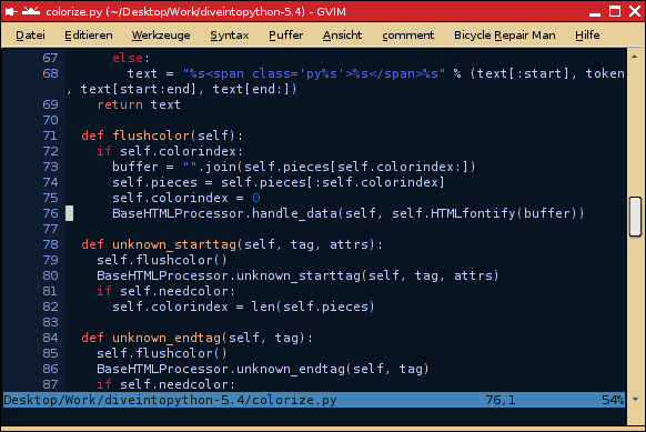
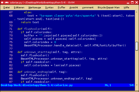
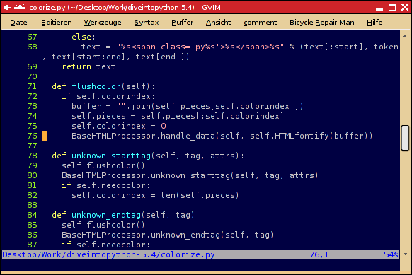
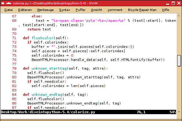
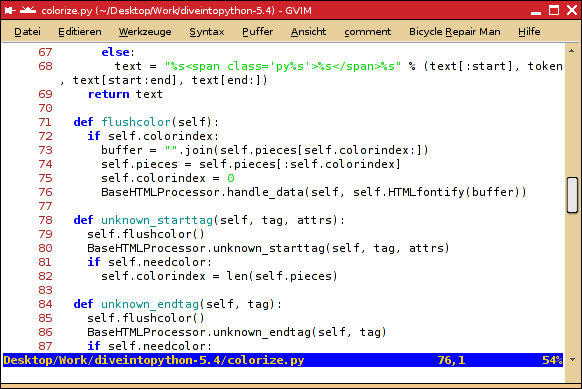
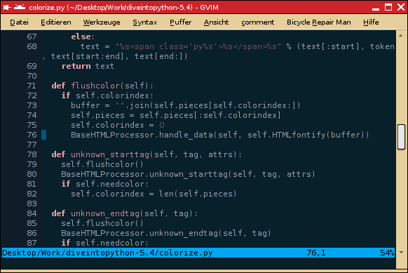
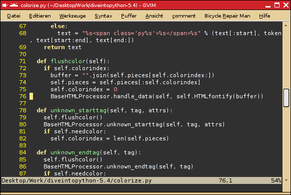
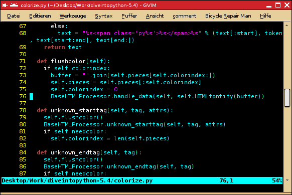
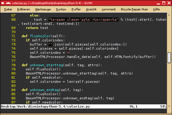
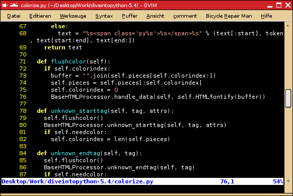
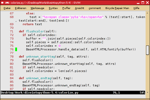
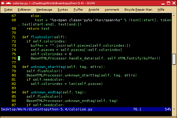
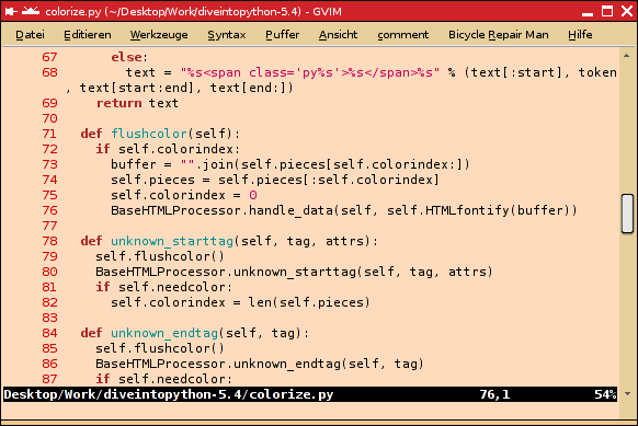
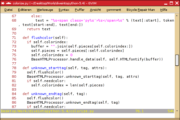
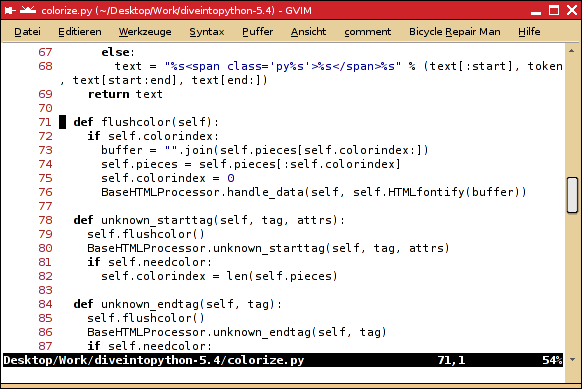
Why is it that most IDE's have a default white background with black text?
Personally it really hurts my eyes. Especially on CRT monitors. The white of a computer monitor is not like say a white paper, it is light. So especially for those of us who are coding over 8 hours a day, which is better for our eyes?
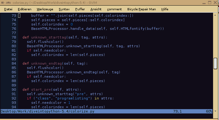
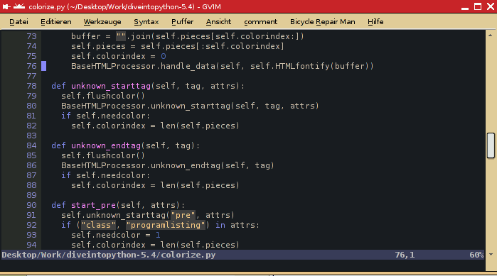
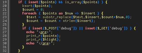
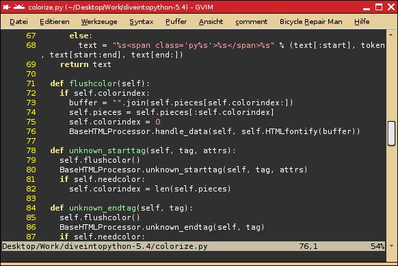
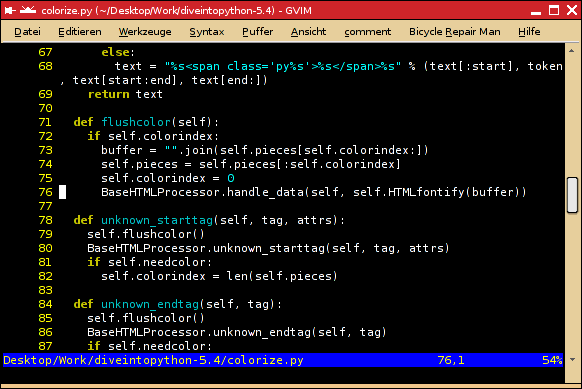
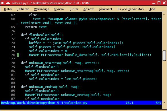
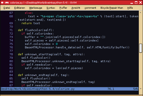
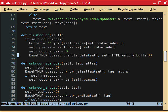
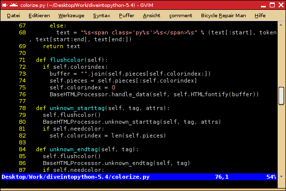
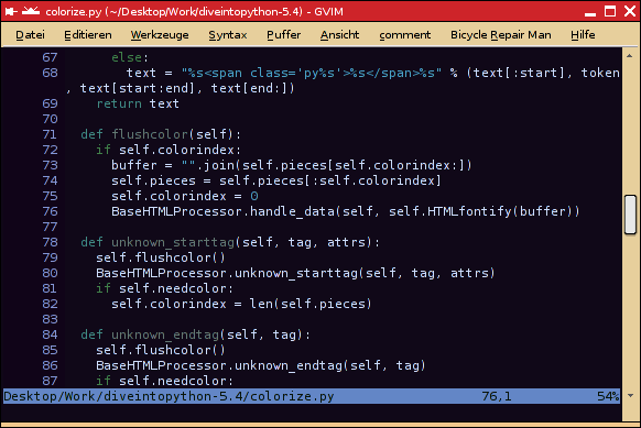
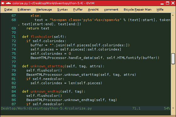
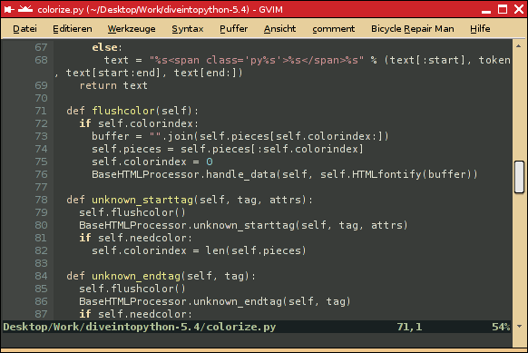
Personally I use a soft green on a black background because green is one of the colors humans perceive best. Green on black provides high contrast. I use soft green so the contrast isn't too high. Seems to work best for me. I hear yellow on blue is best for bright-lit rooms / daylight. But black on white is overkill contrast and really bad on the eyes.
Here is an interesting page about this topic:
http://www.writer2001.com/colwebcontrast.htm







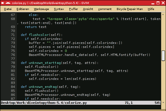

 - carpe noctem
