Amd by request from jgpaiva, here it is with mxskin31:


 Topic: New FARR v2 Icon Design Needed (Read 60,859 times)


 farr2.zip
(68.7 KB - downloaded 317 times.)


i(when was the last time you saw a humamoid figure in the tray)?


TucknDar: I love the one you did. Definitelly a winner. Could you just reduce a bit the lighting in the man's arm? it makes it hard to understand that bit in the icon version.Thanks! here's an updated version, as 256x256 icon, 16x16 icon and zipped version with several formats included in .ico
 farr256.png
(45.8 KB, 256x256 - viewed 592 times.)
 farr16.png
(1005 B, 16x16 - viewed 739 times.) farr2e.zip
(66.8 KB - downloaded 315 times.)
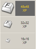 farr key noback 01.jpg
(11.1 KB, 127x170 - viewed 826 times.)
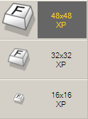 farr key noback 02.jpg
(11.4 KB, 124x168 - viewed 762 times.)
 farr square man.png
(606 B, 16x16 - viewed 697 times.)
 running man nud.png
(847 B, 16x16 - viewed 725 times.)
 I think this is a good idea for farr v2 because it means "the same idea, just VERY refined"


On the running man icon, there are some black pixels in the man's figure, i think that's the "artifacts" that mouser meant.


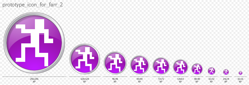

 farr key new angle.png
(871 B, 16x16 - viewed 752 times.) farr key new angle.zip
(986 B - downloaded 314 times.)
Original address: https://www.donationcoder.com/forum/index.php?topic=6629.0