DonationCoder.com forum
 
Read-only archive. This is a static copy of the DonationCoder.com forum. Reading and searching work as before; logging in, posting and private messages do not.
Archive of 2026-10-21 · About this archive · Main site

Last post Author Topic: Forum upgraded Nov 20, 2017  (Read 57,192 times)

ConstanceJill

  • Supporting Member
  • Joined in 2012
  • **
  • Posts: 248
Re: Forum upgraded Nov 20, 2017
« Reply #25 on: November 22, 2017, 12:21 PM »
I think the only thing that really bothers me with the new appearance of quoting boxes is that there is a big opening quotation mark, but no closing one.

tomos

  • Charter Member
  • Joined in 2006
  • ***
  • Posts: 11,970
    • Gathering Badge
    • Participated in NANY Challenge Once
Re: Forum upgraded Nov 20, 2017
« Reply #26 on: November 22, 2017, 12:42 PM »
Re colour/s
another option would be the blue-grey + orange/ish type theme
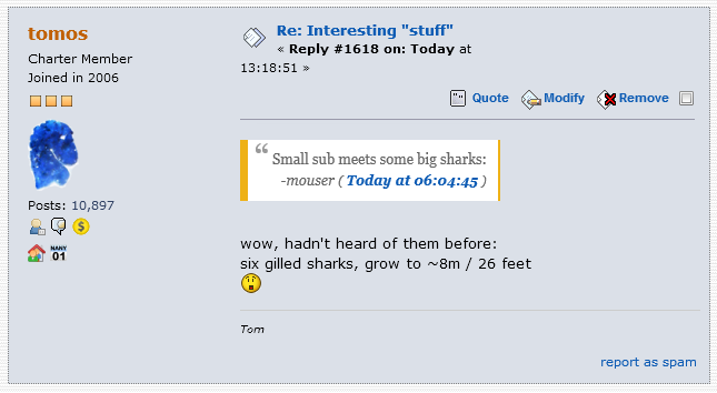
here a couple of variations:


1) Shadow around quote removed, orangeish colour highlight - width reduced on the left:

Screenshot - 2017-11-22 , 13_20_54.png


2) a lighter shade of blue in quote (I didnt do that very well: I couldnt just make it brighter - it changed colour as well); and the orangeish colour highlight - width reduced on the left:

Screenshot - 2017-11-22 , 13_20_54 copy2.png

FWIW my vote would be for something like #1 above
Tom

cranioscopical

  • Friend of the Site
  • Supporting Member
  • Joined in 2006
  • **
  • Posts: 4,776
    • Cody Award
    • Official Forum Clown
    • rotten turkey sandwich - Rotten Turkey Sandwich
Re: Forum upgraded Nov 20, 2017
« Reply #27 on: November 22, 2017, 02:53 PM »
Quote
I prefer the quotation marks to be inside the panel.

What do you mean?

[attach]
Chris

mouser

  • First Author
  • Administrator
  • Joined in 2005
  • *****
  • Posts: 40,931
    • Gathering Badge
    • Plugin Coding Medal
    • Participated in NANY Challenge Seventeen Times
    • Cody Award
    • Coding Snacks
    • Volunteers/Staff
Re: Forum upgraded Nov 20, 2017
« Reply #28 on: November 22, 2017, 11:32 PM »
Quote
I prefer the quotation marks to be inside the panel.

Aren't they already the way you prefer them? Were they ever otherwise?

I see you what you mean about them possibly suggesting a "pull-quote".. That hadn't occurred to me..

Tuxman

  • OMG not him again!
  • Supporting Member
  • Joined in 2006
  • **
  • Posts: 2,522
    • Participated in NANY Challenge Seven Times
Re: Forum upgraded Nov 20, 2017
« Reply #29 on: November 23, 2017, 11:30 AM »
The quotation is rather small here. My poor eyes!  :huh:

Unbenannt.png
I bet when Cheetahs race and one of them cheats, the other one goes "Man, you're such a Cheetah!" and they laugh & eat a zebra or whatever.

mouser

  • First Author
  • Administrator
  • Joined in 2005
  • *****
  • Posts: 40,931
    • Gathering Badge
    • Plugin Coding Medal
    • Participated in NANY Challenge Seventeen Times
    • Cody Award
    • Coding Snacks
    • Volunteers/Staff
Re: Forum upgraded Nov 20, 2017
« Reply #30 on: November 23, 2017, 01:17 PM »
You need to Ctrl+F5 refresh on the page so the new css file is loaded.

Tuxman

  • OMG not him again!
  • Supporting Member
  • Joined in 2006
  • **
  • Posts: 2,522
    • Participated in NANY Challenge Seven Times
Re: Forum upgraded Nov 20, 2017
« Reply #31 on: November 23, 2017, 01:24 PM »
Ah. I thought this was the first time I visit DC on this machine.  :huh:
Fixed!  :P
I bet when Cheetahs race and one of them cheats, the other one goes "Man, you're such a Cheetah!" and they laugh & eat a zebra or whatever.

cranioscopical

  • Friend of the Site
  • Supporting Member
  • Joined in 2006
  • **
  • Posts: 4,776
    • Cody Award
    • Official Forum Clown
    • rotten turkey sandwich - Rotten Turkey Sandwich
Re: Forum upgraded Nov 20, 2017
« Reply #32 on: November 23, 2017, 03:08 PM »
Aren't they already the way you prefer them? Were they ever otherwise?

Nope, perhaps it's terminology. In reply #27 one set of marks is entirely within the white space, which I prefer (the first of the lower two examples).

Also, if one looks at a topic with a run of accumulated quote/response contributions, the quotations appear to look more important than the responses.

I think skwire's view (previous format was better) has considerable merit.
Chris

rgdot

  • Supporting Member
  • Joined in 2009
  • **
  • Posts: 2,197
Re: Forum upgraded Nov 20, 2017
« Reply #33 on: November 23, 2017, 03:15 PM »
the quotations appear to look more important than the responses.

I get this impression as well

wraith808

  • Supporting Member
  • Joined in 2006
  • **
  • Posts: 11,205
    • Participated in NANY Challenge Fourteen Times
    • Coding Snacks
    • Writer
    • Hardware Hacker
Re: Forum upgraded Nov 20, 2017
« Reply #34 on: November 23, 2017, 04:24 PM »
I think skwire's view (previous format was better) has considerable merit.

Perhaps there's no way to easily go back to the previous format?  I would think that if he has not already considered that rather than making changes to the CSS, then perhaps that is a reason that it has less than considerable merit?

mouser

  • First Author
  • Administrator
  • Joined in 2005
  • *****
  • Posts: 40,931
    • Gathering Badge
    • Plugin Coding Medal
    • Participated in NANY Challenge Seventeen Times
    • Cody Award
    • Coding Snacks
    • Volunteers/Staff
Re: Forum upgraded Nov 20, 2017
« Reply #35 on: November 23, 2017, 05:22 PM »
It's easy to go back or change it in lots of ways -- it's just css.
I'm just thinking we need SOME improvement over the old style.  I kind of like this one but I'm still cogitating on the suggestions.
What would be nice is if someone made some alternative css styles for it and shared. Then we could see which we liked best.

wraith808

  • Supporting Member
  • Joined in 2006
  • **
  • Posts: 11,205
    • Participated in NANY Challenge Fourteen Times
    • Coding Snacks
    • Writer
    • Hardware Hacker
Re: Forum upgraded Nov 20, 2017
« Reply #36 on: November 23, 2017, 05:46 PM »
It's easy to go back or change it in lots of ways -- it's just css.
I'm just thinking we need SOME improvement over the old style.  I kind of like this one but I'm still cogitating on the suggestions.
What would be nice is if someone made some alternative css styles for it and shared. Then we could see which we liked best.

So perhaps remove the quote, make the right and left bars something that goes more with the style of the site, and make the font a bit lighter?  Which CSS file is it?  Or can you just post the current CSS?

I see this in http://www.donationcoder.com/forum/Themes/dc2/css/index.css?fin20

Code: ( css)
/* A quote, perhaps from another post. */
.REN_DISABLE_blockquote.bbc_standard_quote, REN_DISABLE_blockquote.bbc_alternate_quote
{
	font-size: x-small;
	color: #000;
	line-height: 1.4em;
	background: url(../images/theme/quote.png) 0.1em 0.1em no-repeat;
	border-top: 2px solid #99A;
	border-bottom: 2px solid #99A;
	padding: 1.1em 1.4em;
	margin: 0.1em 0 0.3em 0;
	overflow: auto;
}

Is that the CSS that would have to be played with?

mouser

  • First Author
  • Administrator
  • Joined in 2005
  • *****
  • Posts: 40,931
    • Gathering Badge
    • Plugin Coding Medal
    • Participated in NANY Challenge Seventeen Times
    • Cody Award
    • Coding Snacks
    • Volunteers/Staff
Re: Forum upgraded Nov 20, 2017
« Reply #37 on: November 23, 2017, 05:48 PM »
Here's the css in question -- note that the first set is overridden mostly by the second set:

Code: ( css)
/*
 fancy block quote
 https://codepen.io/maxds/pen/DcveB
*/


blockquote {
  display:inline-block;
  background: #fff;
  padding: 15px 20px 15px 45px;
  margin: 5px 0 20px;
  position: relative;
  
  /*Font*/
  font-family: Georgia, serif;
  font-size: 120%;
  line-height: 1.2;
  color: #666;
  text-align: justify;
  
  /*Borders - (Optional)*/
  border-left: 15px solid #c76c0c;
  border-right: 2px solid #c76c0c;
  
  /*Box Shadow - (Optional)*/
  -moz-box-shadow: 2px 2px 15px #ccc;
  -webkit-box-shadow: 2px 2px 15px #ccc;
  box-shadow: 2px 2px 15px #ccc;
}

blockquote::before{
  content: "\201C"; /*Unicode for Left Double Quote*/
  /*Font*/
  font-family: Georgia, serif;
  font-size: 60px;
  font-weight: bold;
  color: #999;
  /*Positioning*/
  position: absolute;
  left: 10px;
  top:5px;
}

blockquote::after{
  /*Reset to make sure*/
  content: "";
}

blockquote a{
  text-decoration: none;
  background: #eee;
  cursor: pointer;
  padding: 0 3px;
  color: #c76c0c;
}

blockquote a:hover{
 color: #666;
}

blockquote em{
  font-style: italic;
}

.dcblockquotefrom {
	font-size: 125%;
	font-style: italic;
	font-wight: bold;
	text-align: right;
}

.dcblockquotefrom_extra {
	font-size: 75%;
	background-color: clear;
}
.dcblockquotefrom_extra a {
	background: none;
}


Code: ( css)

/*
We are OVERRIDING the settings in shared/dcstyles.css here for forum specific look
*/


blockquote {
  display:inline-block;
  background: #fff;
  padding: 10px 10px 10px 22px;
  margin: 5px 0 10px;
  position: relative;
  
  /*Font*/
  font-size: 100%;
  color: #666;
  text-align: justify;
  
  /*Borders - (Optional)*/
  
  border-left: 10px solid #c76c0c;
  border-right: 2px solid #c76c0c;
  
/*
  border-left: 10px solid #7bb4e1;
  border-right: 2px solid #7bb4e1;  
*/
  
  /*Box Shadow - (Optional)*/
  -moz-box-shadow: 2px 2px 15px #ccc;
  -webkit-box-shadow: 2px 2px 15px #ccc;
  box-shadow: 2px 2px 15px #ccc;
}

blockquote::before{
  content: "\201C"; /*Unicode for Left Double Quote*/
  /*Font*/
  font-family: Georgia, serif;
  font-size: 25px;
  font-weight: bold;
  color: #999;
  /*Positioning*/
  position: absolute;
  left: 6px;
  top: -1px;
}

blockquote::after{
  /*Reset to make sure*/
  content: "";
}

blockquote a{
  text-decoration: none;
  background: #eee;
  cursor: pointer;
  padding: 0 3px;
  /* color: #c76c0c;*/
}

blockquote a:hover{
 color: #666;
}

blockquote em{
  font-style: italic;
}

.dcblockquotefrom {
	font-size: 100%;
	font-style: italic;
	font-wight: bold;
	text-align: right;
	margin-top: 4px;
}

.dcblockquotefrom_extra {
	font-size: 95%;
	background-color: clear;
}
.dcblockquotefrom_extra a {
	background: none;
}

Deozaan

  • Charter Member
  • Joined in 2006
  • ***
  • Posts: 9,827
    • Participated in NANY Challenge Eight Times
    • Cody Award
Re: Forum upgraded Nov 20, 2017
« Reply #38 on: November 27, 2017, 02:58 AM »
Attachment numbering has been changed from starting at 1 to starting at 0.

This means any post that had only a single image attachment and displayed it in-line with (attach=1) now shows [invalid attachment].

mouser

  • First Author
  • Administrator
  • Joined in 2005
  • *****
  • Posts: 40,931
    • Gathering Badge
    • Plugin Coding Medal
    • Participated in NANY Challenge Seventeen Times
    • Cody Award
    • Coding Snacks
    • Volunteers/Staff
Re: Forum upgraded Nov 20, 2017
« Reply #39 on: November 27, 2017, 03:09 AM »
Should be fixed now -- let me know if you spot any other oddities!

Deozaan

  • Charter Member
  • Joined in 2006
  • ***
  • Posts: 9,827
    • Participated in NANY Challenge Eight Times
    • Cody Award
Re: Forum upgraded Nov 20, 2017
« Reply #40 on: November 27, 2017, 03:26 AM »
Fast work! :Thmbsup:

IainB

  • @Slartibartfarst
  • Supporting Member
  • Joined in 2008
  • **
  • Posts: 7,544
Re: Forum upgraded Nov 20, 2017
« Reply #41 on: November 27, 2017, 07:16 AM »
This is an example of how multiple quotes look when used in an ordered bulleted list:


...and in an ordered numbered list:

  1. 1st bullet point:
    Should be fixed now -- let me know if you spot any other oddities!
  2. 2nd bullet point:
    Should be fixed now -- let me know if you spot any other oddities!
  3. 3rd bullet point:
    Should be fixed now -- let me know if you spot any other oddities!
  4. 4th bullet point:
    Should be fixed now -- let me know if you spot any other oddities!

________________________________________________
Not bad. Seems like an improvement over the former quote style. The graphic of the LH vertical brown bar might be a bit obtrusive (dominant/distracting) though.
From a publishing and reading ergonomics and perception perspective and as a general rule, though they might "look nice" (and I think they do), the insertion of irrelevant (to the meaning of the text) graphic objects should be done sparingly, because such objects will tend to clutter and use up valuable whitespace, whilst providing little or no additional value to the page or text meaning itself, and being a potential visual distraction. This could tend to make the page less efficient for ease/speed of reading and comprehension. That's why I made use of a lot of them - i,e., to see how it all actually appeared on the page. The reader can thus more easily come to their own judgement from the example.
Minimising the size (width/height) of such objects could help to make them less obtrusive.

I think that what I write above probably echoes some of the comments already made by others in this thread.

It would be different where (say) the objects were being used as a visual cue to repeatedly distinguish between certain categories/groups of information in a textbook, on separate pages. Textbooks make use of that quite a lot, and once the categorisation system being used is understood by the reader, the general effect is that of improved/optimised ease/speed of reading and comprehension, and it makes for easier reference searching/checking as well. However, we are not writing textbooks in this case.

Just a thought: If the quotes could be given a unique (on that page) reference number - e.g. as in the little square-bracketed reference numbering used in Wikipedia - then that could also be useful, as they could then be used as hyperlinks and (optionally) footnotes, in wiki-style, or as required. It might also make it a lot easier to compile collections of related posts/notes onto one page, from disparate pages/threads - something that I occasionally do and which currently seems rather cumbersome to do on this forum.
« Last Edit: November 27, 2017, 07:28 AM by IainB »

Nod5

  • Supporting Member
  • Joined in 2006
  • **
  • Posts: 1,175
    • Coding Snacks
    • Participated in NANY Challenge Three Times
    • Plugin Coding Medal
Re: Forum upgraded Nov 20, 2017
« Reply #42 on: February 02, 2018, 01:53 PM »
Does the forum support inline code formatting? Like what wrapping a part of a line in single backticks does in GitHub comments.

Deozaan

  • Charter Member
  • Joined in 2006
  • ***
  • Posts: 9,827
    • Participated in NANY Challenge Eight Times
    • Cody Award
Re: Forum upgraded Nov 20, 2017
« Reply #43 on: February 03, 2018, 04:36 AM »
Does the forum support inline code formatting? Like what wrapping a part of a line in single backticks does in GitHub comments.

Yes, use <code> but change the brackets to square braces. [ ]

Or click the icon that has a pound symbol on it.

mouser

  • First Author
  • Administrator
  • Joined in 2005
  • *****
  • Posts: 40,931
    • Gathering Badge
    • Plugin Coding Medal
    • Participated in NANY Challenge Seventeen Times
    • Cody Award
    • Coding Snacks
    • Volunteers/Staff
Re: Forum upgraded Nov 20, 2017
« Reply #44 on: February 03, 2018, 04:45 AM »
There is a drop-down labeled "code-highlighting" that will allow you to apply syntax highlighting for a given language to a block of text.

Nod5

  • Supporting Member
  • Joined in 2006
  • **
  • Posts: 1,175
    • Coding Snacks
    • Participated in NANY Challenge Three Times
    • Plugin Coding Medal
Re: Forum upgraded Nov 20, 2017
« Reply #45 on: February 03, 2018, 10:15 PM »
Deozaan & mouser:
Not code blocks, I mean a way to make e.g. only the word apple in this sentence appear as code without any linebreaks.
See https://github.com/adam-p/markdown-here/wiki/Markdown-Cheatsheet#code

Original address: https://www.donationcoder.com/forum/index.php?topic=44620.0