DonationCoder.com forum
 
Read-only archive. This is a static copy of the DonationCoder.com forum. Reading and searching work as before; logging in, posting and private messages do not.
Archive of 2026-10-21 · About this archive · Main site

Author Topic: Hack font v.2  (Read 21,987 times)

phitsc

  • Honorary Member
  • Joined in 2008
  • **
  • Posts: 1,198
    • Participated in NANY Challenge Seven Times
    • Plugin Coding Medal
Hack font v.2
« on: September 02, 2015, 06:54 AM »
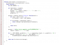
Christopher Simpkins and others' hack font, which I neither knew nor have used (obviously) has been renewed. It presents itself as 'a typeface designed for source code' and is open source. I'm trying it right now and it is actually the first font which I think could make me abandon Consolas.

Hack 9 is about the same height as Consolas 10, but a bit narrower (which is not a disadvantage at all).

http://sourcefoundry.org/hack/
js-source-specimen-hack2.png

mouser

  • First Author
  • Administrator
  • Joined in 2005
  • *****
  • Posts: 40,931
    • Gathering Badge
    • Plugin Coding Medal
    • Participated in NANY Challenge Seventeen Times
    • Cody Award
    • Coding Snacks
    • Volunteers/Staff
Re: Hack font v.2
« Reply #1 on: September 02, 2015, 07:05 AM »
That screenshot looks pretty nice!

Looking at the website you can see how much work has gone into publicizing the font.

Whenever we talk about programming fonts we also can't forget to mention the Dina programming font, created by DC member Jibz -- which is different because it's fixed width and suitable at very low font sizes:
http://www.donationcoder.com/Software/Jibz/Dina/

mwb1100

  • Supporting Member
  • Joined in 2006
  • **
  • Posts: 1,645
Re: Hack font v.2
« Reply #2 on: September 02, 2015, 07:56 AM »
I'll definitely give it a try.  From a quick glance, one problem I might run into is that the "filled zero" ('0') tends to look somewhat like an "at sign" ('@').  I'll have to see if this is really a problem in practice.

phitsc

  • Honorary Member
  • Joined in 2008
  • **
  • Posts: 1,198
    • Participated in NANY Challenge Seven Times
    • Plugin Coding Medal
Re: Hack font v.2
« Reply #3 on: September 02, 2015, 08:06 AM »
The only thing bothering me so far is the fact that Hack's 1 looks like Consolas' lower-case l, which I'm obviously very used to now. And I like the look of Consolas' 1 better as well. On the other hand I like Hack's lower-case l better :)

Jibz

  • Cold Warrior
  • Developer
  • Joined in 2005
  • ***
  • Posts: 1,187
    • Programming School - Stage 1 Medal
    • Coding Snacks
    • Participated in NANY Challenge Four Times
Re: Hack font v.2
« Reply #4 on: September 02, 2015, 08:18 AM »
As pointed out in the HN discussion, it is very similar to DejaVu. Comparison gif:

https://i.imgur.com/8SqL6mT.gif

From a quick glance, I quite like it, except for two things; the zero and the letter i.
"A problem, properly stated, is a problem on it's way to being solved" -Buckminster Fuller
"Multithreading is just one damn thing after, before, or simultaneous with another" -Andrei Alexandrescu

phitsc

  • Honorary Member
  • Joined in 2008
  • **
  • Posts: 1,198
    • Participated in NANY Challenge Seven Times
    • Plugin Coding Medal
Re: Hack font v.2
« Reply #5 on: September 02, 2015, 08:25 AM »
I actually like the rounded i (which is also why I like the l better than the Consolas one). Excellent idea with the comparison gif! :Thmbsup:

wraith808

  • Supporting Member
  • Joined in 2006
  • **
  • Posts: 11,205
    • Participated in NANY Challenge Fourteen Times
    • Coding Snacks
    • Writer
    • Hardware Hacker
Re: Hack font v.2
« Reply #6 on: September 02, 2015, 03:36 PM »
I use Envy Code R, and haven't found anything that would replace it.

Also for more programming fonts: http://www.slant.co/topics/67/~what-are-the-best-programming-fonts

CWuestefeld

  • Supporting Member
  • Joined in 2006
  • **
  • Posts: 1,009
    • Participated in NANY Challenge Once
Re: Hack font v.2
« Reply #7 on: September 02, 2015, 06:50 PM »
Here's a huge gallery of programming fonts, together with pros and cons of each.

http://www.slant.co/topics/67/~what-are-the-best-programming-fonts


wraith808

  • Supporting Member
  • Joined in 2006
  • **
  • Posts: 11,205
    • Participated in NANY Challenge Fourteen Times
    • Coding Snacks
    • Writer
    • Hardware Hacker
Re: Hack font v.2
« Reply #8 on: September 02, 2015, 11:32 PM »
Here's a huge gallery of programming fonts, together with pros and cons of each.

http://www.slant.co/topics/67/~what-are-the-best-programming-fonts

That's the same link I posted in the post right before yours?

Jibz

  • Cold Warrior
  • Developer
  • Joined in 2005
  • ***
  • Posts: 1,187
    • Programming School - Stage 1 Medal
    • Coding Snacks
    • Participated in NANY Challenge Four Times
Re: Hack font v.2
« Reply #9 on: September 03, 2015, 05:04 AM »
In fact, you both posted the same link as I did in this post below, how silly!

http://www.slant.co/topics/67/~what-are-the-best-programming-fonts

"A problem, properly stated, is a problem on it's way to being solved" -Buckminster Fuller
"Multithreading is just one damn thing after, before, or simultaneous with another" -Andrei Alexandrescu

phitsc

  • Honorary Member
  • Joined in 2008
  • **
  • Posts: 1,198
    • Participated in NANY Challenge Seven Times
    • Plugin Coding Medal
Re: Hack font v.2
« Reply #10 on: September 03, 2015, 06:36 AM »
I find it fascinating how many 'programming' fonts there are, and how everyone has their favorite even more so.

Jibz

  • Cold Warrior
  • Developer
  • Joined in 2005
  • ***
  • Posts: 1,187
    • Programming School - Stage 1 Medal
    • Coding Snacks
    • Participated in NANY Challenge Four Times
Re: Hack font v.2
« Reply #11 on: September 03, 2015, 08:17 AM »
I find it fascinating how many 'programming' fonts there are, and how everyone has their favorite even more so.

I think there is a tendency that "craftsmen" feel strongly about their tools. Programmers spend a lot of their time looking at code, so seemingly small differences in editors, fonts, and coding style, appear important to them. Perhaps these details don't really make a big difference in productivity, but I think many have a slight case of CMOD (compulsive-micro-optimization-disorder).
"A problem, properly stated, is a problem on it's way to being solved" -Buckminster Fuller
"Multithreading is just one damn thing after, before, or simultaneous with another" -Andrei Alexandrescu

tomos

  • Charter Member
  • Joined in 2006
  • ***
  • Posts: 11,970
    • Gathering Badge
    • Participated in NANY Challenge Once
Re: Hack font v.2
« Reply #12 on: September 03, 2015, 12:43 PM »
^ using good tools, in any area, makes work more of a pleasure.
I find that anyways.
Tom

mouser

  • First Author
  • Administrator
  • Joined in 2005
  • *****
  • Posts: 40,931
    • Gathering Badge
    • Plugin Coding Medal
    • Participated in NANY Challenge Seventeen Times
    • Cody Award
    • Coding Snacks
    • Volunteers/Staff
Re: Hack font v.2
« Reply #13 on: September 03, 2015, 01:39 PM »
I think there is a tendency that "craftsmen" feel strongly about their tools. Programmers spend a lot of their time looking at code, so seemingly small differences in editors, fonts, and coding style, appear important to them.

I think you are onto something here but i think it goes a bit deeper than that.. Part of the dna of being a "craftsman/maker/etc" seems to be a desire -- a compulsion -- to try building the things we use.  Often this leads to incredibly huge inefficient illogical wastes of time, like a reinventing the wheel and building something that we should just have let someone else build.  There is some real pleasure and learning that comes out of it -- but often it feels like a compulsion that one simply gives in to in order to get the idea out of your head.  :P

Babbel00

  • Alphamale on Betablockers
  • Supporting Member
  • Joined in 2009
  • **
  • Posts: 2
Re: Hack font v.2
« Reply #14 on: September 25, 2015, 08:41 AM »
I used Dina for a long time.. up till my monitor gained a lot of inches (I maintain it was becoz of my eye-sight! but not really.. just greed).. from then on Dina just wasn't workable anymore, since - although it is awesome at smaller sizes - it doesn't scale up nicely.
From that time on (2010) I used Vera Sans Mono (scales better, but isn't monospaced at all of course), and with a stroke of luck I came across Hack too, approx. 2 months ago.
I like it alot more than VSM (http://www.fontsquirrel.com/fonts/bitstream-vera-sans-mono), but I'm still hoping Hack turns up with a true monospaced variant some day soon, because that would be awesome.

I could be German.. I like nicely lining columns and rows of characters THAT much XD
Alphamale on betablockers

Deozaan

  • Charter Member
  • Joined in 2006
  • ***
  • Posts: 9,827
    • Participated in NANY Challenge Eight Times
    • Cody Award
Re: Hack font v.2
« Reply #15 on: September 25, 2015, 08:26 PM »
I don't understand what you mean when you say they're not monospaced.

:huh: As far as I can tell, both Hack and Vera Sans Mono are monospaced. Vera Sans Mono even has "Mono" in its name.

mouser

  • First Author
  • Administrator
  • Joined in 2005
  • *****
  • Posts: 40,931
    • Gathering Badge
    • Plugin Coding Medal
    • Participated in NANY Challenge Seventeen Times
    • Cody Award
    • Coding Snacks
    • Volunteers/Staff
Re: Hack font v.2
« Reply #16 on: September 26, 2015, 09:11 PM »
Welcome to the site, Babbel  :up:

phitsc

  • Honorary Member
  • Joined in 2008
  • **
  • Posts: 1,198
    • Participated in NANY Challenge Seven Times
    • Plugin Coding Medal
Re: Hack font v.2
« Reply #17 on: January 18, 2016, 08:29 AM »
app.programmingfonts.org which lets you test a number of programming fonts (only one at a time though) was featured in O'Reilly's most recent programming newsletter

Original address: https://www.donationcoder.com/forum/index.php?topic=41537.0