


What do you get when you cross something like Launchy and Mouser's FARR and wrap it in something that looks like an Adobe Air interface? You get Ubuntu's HUD (Heads Up Display) - Mark Shuttleworth's latest foray into 'original'  interface design for his adopted wonder-child.
Check out the following video. Does any of this look familiar?
It's a bit much to go into in a post. So the logical starting place is Mssr. Shuttleworth's own blog where he speaks rapturously about his latest brainstorm:
What I find quite interesting in this blog post is the first image that follows the above text. It's this:
[attach]
interface design for his adopted wonder-child.Check out the following video. Does any of this look familiar?
It's a bit much to go into in a post. So the logical starting place is Mssr. Shuttleworth's own blog where he speaks rapturously about his latest brainstorm:
Quote
Introducing the HUD. Say hello to the future of the menu.
Tuesday, January 24th, 2012
The desktop remains central to our everyday work and play, despite all the excitement around tablets, TV’s and phones. So it’s exciting for us to innovate in the desktop too, especially when we find ways to enhance the experience of both heavy “power” users and casual users at the same time. The desktop will be with us for a long time, and for those of us who spend hours every day using a wide diversity of applications, here is some very good news: 12.04 LTS will include the first step in a major new approach to application interfaces.
This work grows out of observations of new and established / sophisticated users making extensive use of the broader set of capabilities in their applications. We noticed that both groups of users spent a lot of time, relatively speaking, navigating the menus of their applications, either to learn about the capabilities of the app, or to take a specific action. We were also conscious of the broader theme in Unity design of leading from user intent. And that set us on a course which lead to today’s first public milestone on what we expect will be a long, fruitful and exciting journey.
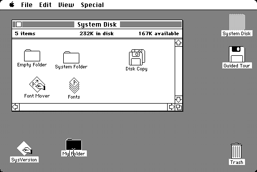
The menu has been a central part of the GUI since Xerox PARC invented ‘em in the 70′s. It’s the M in WIMP and has been there, essentially unchanged, for 30 years.
What I find quite interesting in this blog post is the first image that follows the above text. It's this:
[attach]


 , but even there 'tis not always well received unless you get very lucky
 .)
 - for centuries.


 . But creation is difficult at best
 . A simple email is tedious, an extended email is difficult. Any other creative effort is well nigh impossible. And HUD does nothing to alleviate that. In general, a HUD is supposed to allow you to consume certain important data without significantly distracting you from the task at hand. So it makes sense in vehicles, e.g., aircraft, automobiles (although successful implementation there seems a long way off). And HUD as currently implemented works fine on PCs. (Although we don't call it HUD


