I've dabbling with tweaking my website look. I like tranglos' site very much, see here:
http://ethervane.com/
Anyway, that's besides the point. What I don't really understand is how come the sans-serif fonts sometimes look good in browsers, and sometimes they don't? There's something weird there. I normally tend to prefer the sans-serif fonts like helvetica, arial, calibri, verdana...but when it goes on the website, something happens that I don't always understand.
So if you look at my site right now, you'll notice that the normal text has a jagged look about it:

How can I get those characters to be more smooth? More of a "cleartype" look? Another thing I've noticed is this thing:
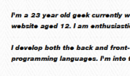
Why does that happen? I think those sites are intended to look good on macs, and not pc's.
What I would really like the font to look like is more of what we see with the fonts on Word (or any word processor):

Actually, that doesn't look as good as I expected. Maybe it's this XP computer I have at work. I think these all looked better at home on my Windows 7 computer.
The end goal of all this: what is the best sans-serif font(s) for me to use for a website? but I don't want to turn this into another best fonts discussion. i want to address the specific questions above.
http://ethervane.com/
Anyway, that's besides the point. What I don't really understand is how come the sans-serif fonts sometimes look good in browsers, and sometimes they don't? There's something weird there. I normally tend to prefer the sans-serif fonts like helvetica, arial, calibri, verdana...but when it goes on the website, something happens that I don't always understand.
So if you look at my site right now, you'll notice that the normal text has a jagged look about it:

How can I get those characters to be more smooth? More of a "cleartype" look? Another thing I've noticed is this thing:
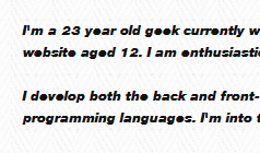
Why does that happen? I think those sites are intended to look good on macs, and not pc's.
What I would really like the font to look like is more of what we see with the fonts on Word (or any word processor):

Actually, that doesn't look as good as I expected. Maybe it's this XP computer I have at work. I think these all looked better at home on my Windows 7 computer.
The end goal of all this: what is the best sans-serif font(s) for me to use for a website? but I don't want to turn this into another best fonts discussion. i want to address the specific questions above.