DonationCoder.com forum
 
Read-only archive. This is a static copy of the DonationCoder.com forum. Reading and searching work as before; logging in, posting and private messages do not.
Archive of 2026-10-21 · About this archive · Main site

Author Topic: Font Survey: 42 of the Best Monospaced Programming Fonts  (Read 14,078 times)

Armando

  • Charter Member
  • Joined in 2005
  • ***
  • Posts: 2,727
    • Coding Snacks
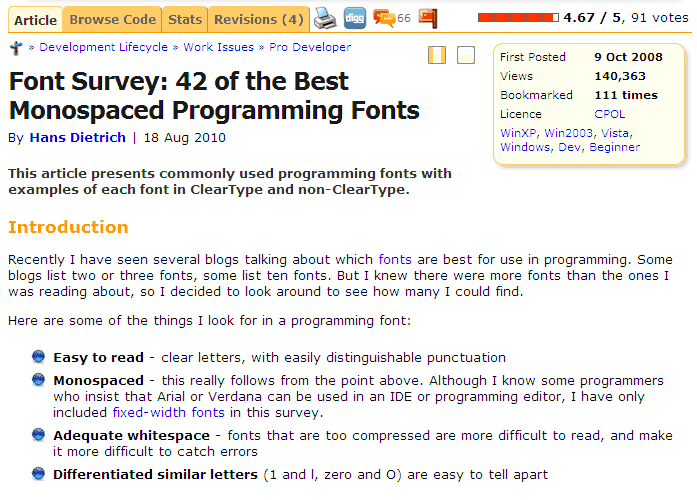
Font Survey: 42 of the Best Monospaced Programming Fonts
« on: October 08, 2010, 04:17 AM »
Another font thread. :)

The article isn't exactly new, but I went through it today and tried to find the best font (again... 3rd time in the last 2 years...) for coding.

[attach]
"I suppose it can be said that I'm an absent-minded driver. It's true that I've driven through a number of red lights on occasion, but on the other hand, I've stopped at a lot of green ones but never gotten credit for it."
Glenn Gould

Jibz

  • Cold Warrior
  • Developer
  • Joined in 2005
  • ***
  • Posts: 1,187
    • Programming School - Stage 1 Medal
    • Coding Snacks
    • Participated in NANY Challenge Four Times
Re: Font Survey: 42 of the Best Monospaced Programming Fonts
« Reply #1 on: October 08, 2010, 06:35 AM »
Another font thread. :)

The article isn't exactly new, but I went through it today and tried to find the best font (again... 3rd time in the last 2 years...) for coding.

That is a very nice comparison I think.

I admit I sometimes need a  "clear type" break... but, generally I prefer  "clear type" on my laptop LCD.
LCD's are not all the same -- mine has very "sharp" pixels (this could also be due to the graphical adapter I suppose... But I'm far from being an expert in that field).

A good point. If you spend a lot of your time looking at code/text in an editor, I believe it is important to take the time to try out a few fonts and see which ones work for you and for the monitor you are using. Also, try with different types of text -- some fonts work well for code but make it less pleasant to read a passage of text, some the other way around.

In my experience, the size of your screen, the resolution, and how cleartype looks on your particular hardware, can have a big impact on readability and on how much it stresses your eyes.

For instance, I am (still) using a 17" LCD at 1280x1024. On that, I like Consolas at 10 pt. At 9 pt it starts having some artifacts, like the dot over the i being off center, and at 8 pt some characters start getting 'smudgy', like m and w. Such things distract my eye when reading a line. But at 10 pt it's very good here :Thmbsup:.

A font like Dina was initially designed for 8 pt, because that was the size that happened to work best on my screen. The larger sizes were added because people with larger LCDs sometimes had trouble reading Dina at 8 pt. From the feedback I have gotten, they seem to work well, but Dina 10 pt looks huge on my little screen :-[.
"A problem, properly stated, is a problem on it's way to being solved" -Buckminster Fuller
"Multithreading is just one damn thing after, before, or simultaneous with another" -Andrei Alexandrescu

phitsc

  • Honorary Member
  • Joined in 2008
  • **
  • Posts: 1,198
    • Participated in NANY Challenge Seven Times
    • Plugin Coding Medal
Re: Font Survey: 42 of the Best Monospaced Programming Fonts
« Reply #2 on: October 08, 2010, 07:25 AM »
I've been using Consolas for programming since its release and been very happy with it. The only problem I have with it is that I have to use it at 11 pt, as 10 is too small for me (while Courier New 10 is just about right). I wish Consolas had a 10.5 size.

Armando

  • Charter Member
  • Joined in 2005
  • ***
  • Posts: 2,727
    • Coding Snacks
Re: Font Survey: 42 of the Best Monospaced Programming Fonts
« Reply #3 on: October 08, 2010, 02:09 PM »
That is a very nice comparison I think.

Isn't it?  :)

A good point. If you spend a lot of your time looking at code/text in an editor, I believe it is important to take the time to try out a few fonts and see which ones work for you and for the monitor you are using. Also, try with different types of text -- some fonts work well for code but make it less pleasant to read a passage of text, some the other way around.

Completely agree. That's why tend to switch between 3 or 4 fonts, depending on what I'm looking at. There's another one I sometimes use : Osaka Unicode. But I usually end up switching to Dina after a few hours.

For instance, I am (still) using a 17" LCD at 1280x1024. On that, I like Consolas at 10 pt. At 9 pt it starts having some artifacts, like the dot over the i being off center, and at 8 pt some characters start getting 'smudgy', like m and w. Such things distract my eye when reading a line. But at 10 pt it's very good here :Thmbsup:.

Consolas looks amazing on my 1280x800 laptop LCD... At 8pt ! But you're right about the m and w. They aren't as clear as Dina's. But... My eyes and brain don't seem to bother.

I like small fonts (vertically AND horizontally) -- need to see as much as possible without having to scroll every second!

A font like Dina was initially designed for 8 pt, because that was the size that happened to work best on my screen. The larger sizes were added because people with larger LCDs sometimes had trouble reading Dina at 8 pt. From the feedback I have gotten, they seem to work well, but Dina 10 pt looks huge on my little screen :-[.

This morning I'm using Dina 8pt. :Thmbsup:
"I suppose it can be said that I'm an absent-minded driver. It's true that I've driven through a number of red lights on occasion, but on the other hand, I've stopped at a lot of green ones but never gotten credit for it."
Glenn Gould

Armando

  • Charter Member
  • Joined in 2005
  • ***
  • Posts: 2,727
    • Coding Snacks
Re: Font Survey: 42 of the Best Monospaced Programming Fonts
« Reply #4 on: October 08, 2010, 02:17 PM »
I've been using Consolas for programming since its release and been very happy with it. The only problem I have with it is that I have to use it at 11 pt, as 10 is too small for me (while Courier New 10 is just about right). I wish Consolas had a 10.5 size.

Hmmmm.... 11 would definitely be too big on my screen. Maybe there's another one that'd fit the bill. Others that I like (but haven't used extensively)  :

- AdaptiveCode Regular 11 point
- Monospace 821 BT 10 point
"I suppose it can be said that I'm an absent-minded driver. It's true that I've driven through a number of red lights on occasion, but on the other hand, I've stopped at a lot of green ones but never gotten credit for it."
Glenn Gould

Armando

  • Charter Member
  • Joined in 2005
  • ***
  • Posts: 2,727
    • Coding Snacks
Re: Font Survey: 42 of the Best Monospaced Programming Fonts
« Reply #5 on: October 08, 2010, 02:28 PM »
I just compared Monospace 821 BT 10 point with Consolas 11 and 10... And it looks pretty good. Could almost replace a "Consola 10.5" (if it existed) in my book. Not as narrow a Consola 10, but less tall. And very clear. The only problem : no slashed zero.

AdaptiveCode Regular 11 point... Isn't free. There's a sophisticated feel to it, but I'm not sure I'd like it for long term usage anyway. Still worth trying.
"I suppose it can be said that I'm an absent-minded driver. It's true that I've driven through a number of red lights on occasion, but on the other hand, I've stopped at a lot of green ones but never gotten credit for it."
Glenn Gould

megar

  • Supporting Member
  • Joined in 2008
  • **
  • Posts: 14
Re: Font Survey: 42 of the Best Monospaced Programming Fonts
« Reply #6 on: October 08, 2010, 06:06 PM »
There is only one font better than Consolas, it is Consolas Sans Typewriter !

Liberation Mono is good, too. (and free !)
http://en.wikipedia.org/wiki/Liberation_fonts

Original address: https://www.donationcoder.com/forum/index.php?topic=24197.0