


I know this is an old thread, but I wanted to address just a few of of tranglos' SFFS comments.
The program has improved over the past 3 years. The scheduler is much more stable now, and not as confusing as it once was with the promts for ExtremeSync and what not. Now, the scheduling dialog is pretty straight forward and works better. I, too, was confused intially by all the startup/stopping background scheduler, extremesynce, etc. issues. I haven't experienced anything like that in the past year anymore.
The interface is slightly improved, but overall still the same. It's not good. I hate to say that because it's such a good program and Tobias is pretty helpful. But the interface is a little bit wacky. SFFS would definitely be the hands-down favorite if the interface was fixed. For example, when you want to just sync certain folders, you are presented with the following radio buttons:
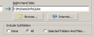
So you would ask, "How do I select the folders?" Well, when you click the radio button for select folders and files, then the explorer tree hierarchy dialog pops up. But that REALLY strange because radio buttons shouldn't behave that way. Radio buttons should only move the dot around to the selected item, not activate additional dialogs or windows. What it SHOULD be is like that "Browse" button above it. When a user sees that button, he expects a dialog to pop up.
That's just one example. The whole interface needs to be revamped. I was hoping it was going to happen for v5, but it didn't. All those horizontal tabs, and the tabs within the tabs within the list of tabs needs to just be reorganized and cleaned up. It's way too much. But that's the only complaint I have about the software.
The program has improved over the past 3 years. The scheduler is much more stable now, and not as confusing as it once was with the promts for ExtremeSync and what not. Now, the scheduling dialog is pretty straight forward and works better. I, too, was confused intially by all the startup/stopping background scheduler, extremesynce, etc. issues. I haven't experienced anything like that in the past year anymore.
The interface is slightly improved, but overall still the same. It's not good. I hate to say that because it's such a good program and Tobias is pretty helpful. But the interface is a little bit wacky. SFFS would definitely be the hands-down favorite if the interface was fixed. For example, when you want to just sync certain folders, you are presented with the following radio buttons:
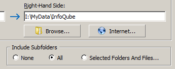
So you would ask, "How do I select the folders?" Well, when you click the radio button for select folders and files, then the explorer tree hierarchy dialog pops up. But that REALLY strange because radio buttons shouldn't behave that way. Radio buttons should only move the dot around to the selected item, not activate additional dialogs or windows. What it SHOULD be is like that "Browse" button above it. When a user sees that button, he expects a dialog to pop up.
That's just one example. The whole interface needs to be revamped. I was hoping it was going to happen for v5, but it didn't. All those horizontal tabs, and the tabs within the tabs within the list of tabs needs to just be reorganized and cleaned up. It's way too much. But that's the only complaint I have about the software.


