


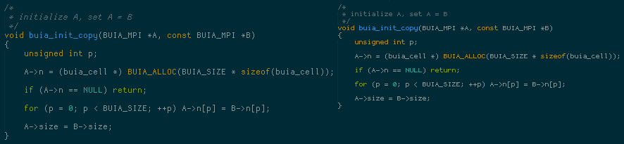
I absolutely love the Dina font for programming - very clear. However, I find the minimum size of 8 to be a bit too large. It would be great if the Dina font could be made in size 7, 6.5 or even 6.
Dina font in size 7, 6.5 or 6 ?
« on: February 12, 2008, 09:37 PM »


 - carpe noctem


 There is something fascinating about the expressiveness you can get from so few pixels, how much moving a pixel or two around can matter for readability and feel.
 .
 .


 .
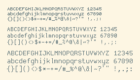


 Dina-2.90.zip